React Navigation TS Template
This topic describes the functions of the React Navigation TypeScript (TS) template. For more information, see the GitHub repository.
Note: This project depends on
TYSdk.mobile.mobileInfo.appRnVersionv5.28 or later. If the earlier app version is used, go to Tuya Panel-RN to download the required version.
Overview
React Navigation is the official solution recommended by React Native. It is a separate easy-to-use navigation library. The view in React Navigation is a native component and uses the Animated library running on a native thread. This ensures smooth performance. In addition, its animation forms and gestures can be easily customized. For more information, see the official documentation of React Navigation.
The template project is a TS template based on React Native 0.59. You can view the default transition animations and custom transition animations of React Navigation.
Directory
Note: This topic only describes the directories related to the scaffold. For more information about the general directory structure, see RN 0.59 TS Template.
├── src
│   ├── api // Includes multiple types of cloud API operations that are used to run the project.
│   ├── components // Includes reusable functional components that are used to run the project.
│   ├── composeLayout.tsx // Encapsulates `device events` and `device information` that are required on the panel.
│   ├── config // Includes common configuration files that are used on the panel.
│   ├── i18n // Includes configuration files to support multiple languages.
│   ├── main.tsx // The project entry file. Create a Navigator instance through the `createNavigator` method. This method accepts two parameters: router and `screenOptions`.
│   ├── models // Includes the code of redux.
│   ├── pages // Includes page-level components of the project.
│   ├── res // Includes local resources, such as pictures and SVG path.
│   └── utils // Includes common utilities and methods that are used on the panel.
Route transition configuration
import { createNavigator, NavigationRoute, GlobalTheme, BrickButton, TransitionPresets } from 'tuya-panel-kit';
import { useNavigation, useRoute } from '@react-navigation/native';
import { Text, View } from 'react-native';
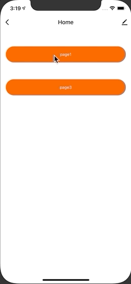
function HomeScreen() {
const navigation = useNavigation();
const data = [
{ text: 'page1', path: 'page1' },
{ text: 'page3', path: 'page3' },
];
return (
<View style={{ justifyContent: 'center', alignItems: 'center' }}>
{data.map(({ text, path }) => {
return (
<BrickButton
style={{ marginTop: 50 }}
key={path}
text={text}
onPress={() => {
navigation.navigate(path, { name: path });
}}
/>
);
})}
</View>
);
}
function Page1() {
const route = useRoute();
const navigation = useNavigation();
return (
<BrickButton
text='Page1'
onPress={() => {
navigation.push('page2');
}}
/>
);
}
function Page2() {
const route = useRoute();
const navigation = useNavigation();
return (
<BrickButton
text='Page2'
onPress={() => {
navigation.push('main');
}}
/>
);
}
function Page3() {
return <FetchList pageId="page3" />;
}
const router: NavigationRoute[] = [
{
name: 'main',
component: Home,
options: {
title: 'Home',
},
},
{
name: 'page1',
component: Page1,
options: {
title: 'First Page',
gesture: true,
hideTopbar: false,
...TransitionPresets.ModalPresentationIOS,
},
},
{
name: 'page2',
component: Page2,
options: {
title: 'Scond Page',
...TransitionPresets.SlideFromRightWithMargin,
},
},
{
name: 'page3',
component: Page3,
options: {
title: 'Third Page',
},
},
];
interface Props {
theme: GlobalTheme;
}
const Navigator = createNavigator < Props > ({ router, screenOptions: {} });
Pass parameters to routes
- Pass parameters: put them in
screenOptionsas a second parameter to thenavigation.navigatefunction. - Receive parameters: get the route through
useRouteon the page, and then get the route parameters throughroute.params.
Cross-page configuration
For some common configurations of the page, you can set screenOptions for createNavigator. For example, the following settings apply to the transition animation:
SlideFromRightWithMargin:ModalPresentationIOS: standard iOS modal presentation style (introduced in iOS 13).SlideFromRightIOS: standard iOS navigation transition.ModalSlideFromBottomIOS: standard iOS navigation transition for modals.FadeFromBottomAndroid: standard Android navigation transition that applies when activity is opened or closed on Android Oreo earlier than Android 9.RevealFromBottomAndroid: standard Android navigation transition that applies when an activity is opened or closed on Android 9 (Pie).ScaleFromCenterAndroid: standard Android navigation transition that applies when an activity is opened or closed on Android 10 (Q).DefaultTransition: default navigation transition for the current platform.ModalTransition: default modal transition for the current platform.
Move between screens
navigation.navigate(RouteName): pushes a new route to the stack navigator if it is not in the stack. Otherwise, it jumps to that screen.navigation.goBack(): The header bar automatically shows a back button. You can also programmatically go back by callingnavigation.goBack(). On Android, the hardware back button just works as expected.navigation.replace(): replaces the current route with a new one.navigation.push(RouteName): pushes a new route onto the stack. Different fromnavigate, this method allows you to repeatedly push the same route.navigation.pop(): goes back in the stack. Different fromgoBack, this method can receive a parameter that indicates the number of layers to be returned.navigation.popToTop(): goes to the top of the stack.
Route options
| Item | Type | Description |
|---|---|---|
| title | string |
Custom title. |
| style | StyleProp<ViewStyle> |
Container style. |
| background | number (rendering a local picture)|string (rendering color)|{ uri: string }|RadialGradientBackground (rendering a network picture)|LinearGradientBackground (rendering a linear gradient) |
Custom panel background. |
| topbarStyle | StyleProp<ViewStyle> |
TopBar style. |
| topbarTextStyle | StyleProp<TextStyle> |
Custom text style of the header bar. |
| backgroundStyle | StyleProp<ViewStyle> |
Custom panel background style. |
| showOfflineView | boolean |
Specifies whether to display the offline mask. Default value: true. |
| hideTopbar | boolean |
Specifies whether to hide top bar. Default value: false. |
| gesture | ||
| boolean | Specifies whether to allow gestures. Default value: false. | |
| isBleOfflineOverlay | boolean |
Specifies whether the Bluetooth offline prompt covers the entire panel (except the header bar). Default value: true. |
| renderTopBar | () => JSX.Element |
Custom rendering header bar. |
| renderStatusBar | () => JSX.Element |
Custom rendering status bar. |
RadialGradientBackground
export interface RadialGradientBackground {
	cx? : string;
	cy? : string;
	fx? : string;
	fy? : string;
	rx? : string;
	ry? : string;
	stops? : StopsProps[];
}
LinearGradientBackground
export interface LinearGradientBackground {
	x1? : string;
	x2? : string;
	y1? : string;
	y2? : string;
	stops? : Record<string, string>;
}
Is this page helpful?
YesFeedbackIs this page helpful?
YesFeedback


