Wireless Switch Template
This topic describes the specific functions of wireless switch templates and how to use these templates. For more information, see the GitHub repository.
Note: This project depends on
TYSdk.mobile.mobileInfo.appRnVersionv5.28 or later. If the earlier application version is used, go to Tuya Panel-RN to download the required version.
Overview
This wireless switch template project is built based on React Native 0.59 and supports the following functions:
- Create linkage
- Associate button actions with scene rules
- Trigger linkage
- Edit linkage
Directories
Note: Only the directories related to the scaffold are described here. For more information about the general directory structure, see RN 0.59 TS Template.
├── src
│   ├── api // Includes multiple types of cloud API operations that are used to run the project.
│   ├── components // Includes reusable functional components that are used to run the project.
│   ├── composeLayout.tsx // Encapsulates `device events` and `device information` that are required on the panel.
│   ├── config // Includes common configuration files that are used on the panel.
│   ├── pages // Includes page-level components of the project.
│   ├── i18n // Includes configuration files to support multiple languages.
│   ├── main.tsx // The project entry files that are inherited from `NavigatorLayout`. Rewrite the `hookRoute` method to define necessary configurations, such as the background and top bar. Rewrite the `renderScene` method to control routing jump.
│   ├── models // Includes the code of redux.
│   ├── res // Includes local resources, such as pictures.
│   ├── icons // Includes local resources, such as SVG paths.
│   └── utils // Include common utility methods that are used on the panel.
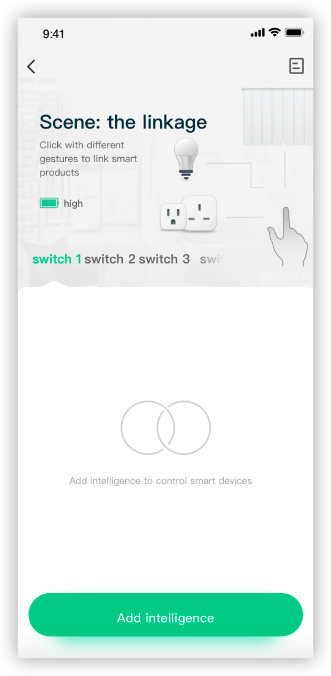
Service process and UI interaction
- Select a button of the wireless switch to be managed on the app.
- Tap Add and select the conditions that apply to the button.
- On the product creation page, select the required actions and edit the product name.
- Select a preferred scene that is supported by the wireless switch.
- Trigger the linkage from the linkage list.
- Run the actions that are supported by the scene.
UI interaction
Encapsulated utility methods
Directory: utils/index.ts
Note: The following sections describe the encapsulated utility methods that simplify smart product development and maintenance.
The following methods are included:
- getFaultStrings: parses alert DPs and returns alert text.
- getTxt: returns text that indicates different battery levels.
- getDeviceInfo: returns information about devices that are linked to a specific scene action.
- getIconList: returns a list of device icons that are linked to a specific scene action.
import { getTxt } from '@utils';

const eleTxt = getTxt(10);
DP protocol
Knob button
| Parameter | Value |
|---|---|
| id | 1 |
| code | switch1_value |
| type | enum |
| mode | Report only |
| value | { "range" : [ "single_click", "double_click", "long_press" ], "type" : "enum" } |
| description | Controls the modes of a wireless switch button: tap, double-tap, and tap and hold. The enumeration value of this DP is not allowed to be modified, increased, or decreased. |
Knob switch
| Parameter | Value |
|---|---|
| id | 12 |
| code | knob_switch_mode_1 |
| type | enum |
| mode | Report only |
| value | { "range" : [ "clockwise_rotation", "anticlockwise_rotation" ], "type": "enum" } |
| description | Controls the modes of a wireless switch knob: turn clockwise and turn counterclockwise The enumeration value of this DP is not allowed to be modified, increased, or decreased. |
Battery capacity
| Parameter | Value |
|---|---|
| id | 10 |
| code | battery_percentage |
| type | value |
| mode | Report only |
| value | { "unit": "%", "min": 0, "max": 100, "scale": 0, "step": 1, " type": "value" } |
| description | Displays the remaining battery capacity of the wireless switch. The value of the DP cannot be modified, increased, or decreased. |
Is this page helpful?
YesFeedbackIs this page helpful?
YesFeedback


