BrickButton 块状按钮
更新时间:2021-04-22 10:21:27LLM 副本以 Markdown 格式查看下载 PDF
BrickButton是在 Button 功能的基础上进行的丰富。
代码演示
说明:详细 Demo 可参考BrickButton Demo。
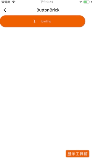
import { BrickButton } from "tuya-panel-kit";

<BrickButton text="loading" loading={true} />;
交互演示
API
style
容器样式。
| 类型 | 必传 | 默认值 |
|---|---|---|
ViewPropTypes.style |
否 | null |
onPress
点击事件。
| 类型 | 必传 | 默认值 |
|---|---|---|
()=> void |
否 | () => {} |
onChange
事件监听集合。
onShowUnderlay:当底层的颜色被显示的时候调用。onHideUnderlay:底层的颜色被隐藏的时候调用。
| 类型 | 必传 | 默认值 |
|---|---|---|
(eventName, ...args) => void |
否 | () => {} |
loading
是否显示读取的状态。
| 类型 | 必传 | 默认值 |
|---|---|---|
boolean |
否 | false |
text
按钮文字。
| 类型 | 必传 | 默认值 |
|---|---|---|
PropTypes.string |
否 | PropTypes.array |
textStyle
按钮文字样式。
| 类型 | 必传 | 默认值 |
|---|---|---|
Text.propTypes.style |
否 | null |
type
按钮类型。
primary:长条型。primaryGradient:长条型带渐变。primaryBorder:长条形带圆角。normal:正常大小按钮。small:小型按钮。
| 类型 | 必传 | 默认值 |
|---|---|---|
oneOfType |
否 | primary |
wrapperStyle
按钮内部包括的内容样式。
| 类型 | 必传 | 默认值 |
|---|---|---|
ViewPropTypes.style |
否 | null |
underlayColor
按钮点按时的颜色。
| 类型 | 必传 | 默认值 |
|---|---|---|
ColorPropType |
否 | null |
showUnderlay
是否显示点击时的按钮颜色。
| 类型 | 必传 | 默认值 |
|---|---|---|
ColorPropType |
否 | true |
loadingColor
loading 组件主颜色。
| 类型 | 必传 | 默认值 |
|---|---|---|
ColorPropType |
否 | #fff |
loadingBackground
loading 背景颜色。
| 类型 | 必传 | 默认值 |
|---|---|---|
number |
否 | rgba(0, 0, 0, 0.1) |
loadingSize
loading 大小。
| 类型 | 必传 | 默认值 |
|---|---|---|
'small' | 'large' | number |
否 | 'small' |
loadingStrokeWidth
loading 外边框粗细。
| 类型 | 必传 | 默认值 |
|---|---|---|
number |
否 | 2 |
background
渐变背景。
| 类型 | 必传 | 默认值 |
|---|---|---|
object |
否 | { x1: '0%', y1: '0%', x2: '0%', y2: '100%', stops: { '0%': 'red', '30%': 'blue', '100%': 'yellow', }, } |
该内容对您有帮助吗?
是意见反馈该内容对您有帮助吗?
是意见反馈
关注“涂鸦智能”
涂鸦服务尽在掌握

关注“全球智能商业”
第一时间获取物联网资讯


