Modal 遮罩
更新时间:2021-04-22 10:21:28LLM 副本以 Markdown 格式查看下载 PDF
简介
Modal是一个遮罩层。
代码演示
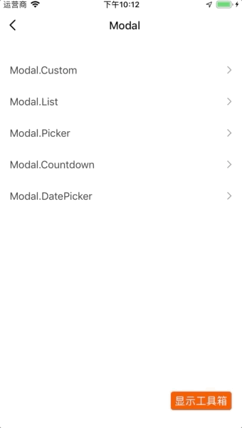
说明:详细示例可参考 Demo。
基本用法
import React from "react";
import { View, Text, TouchableOpacity, StyleSheet } from "react-native";
import { Modal } from "tuya-panel-kit";
import ManyModal from "./manyModal";

export default class CustomModalScene extends React.Component {
  constructor(props) {
    super(props);
    this.state = {
      modalVisible: false,
      modalText: "I am a Portal111!!!",
    };
  }

  changeText = (string) => {
    this.setState({
      modalText: string || "Ho~Ho~Ho!",
    });
  };

  render() {
    return (
      <View style={{ flex: 1 }}>
        <TouchableOpacity
          onPress={() => this.setState({ modalVisible: true })}
          style={styles.buttonStyle}
        >
          <Text style={styles.textStyle}>Click Me!</Text>
        </TouchableOpacity>
        <Modal
          visible={this.state.modalVisible}
          onMaskPress={() => this.setState({ modalVisible: false })}
        >
          <Text style={styles.textStyle}>{this.state.modalText}</Text>
          <TouchableOpacity
            onPress={() => this.setState({ modalText: "Ho~Ho~Ho!" })}
            style={styles.buttonStyle}
          >
            <Text style={styles.textStyle}>Change Text!</Text>
          </TouchableOpacity>
        </Modal>
        <ManyModal text={this.state.modalText} changeText={this.changeText} />
      </View>
    );
  }
}

const styles = StyleSheet.create({
  buttonStyle: {
    height: 44,
    backgroundColor: "#fff",
    justifyContent: "center",
    marginTop: 20,
  },
  textStyle: {
    color: "#333",
    textAlign: "center",
    backgroundColor: "#fff",
  },
});
Modal.List
import React from "react";
import { View, Text, TouchableOpacity, StyleSheet } from "react-native";
import { Modal } from "tuya-panel-kit";

export default class ListModalScene extends React.Component {
  constructor(props) {
    super(props);
    this.state = {
      value: ["1"],
      visible: false,
    };
  }

  closeModal = () => {
    this.setState({ visible: false });
  };

  handleConfirm = (value) => {
    this.setState({ visible: false, value });
  };

  render() {
    const dataSource = [
      {
        key: "1",
        title: "1",
        value: "1",
      },
      {
        key: "2",
        title: "2",
        value: "2",
      },
    ];
    return (
      <View style={{ flex: 1 }}>
        <TouchableOpacity
          onPress={() => this.setState({ visible: true })}
          style={styles.buttonStyle}
        >
          <Text style={styles.textStyle}>Click Me</Text>
        </TouchableOpacity>
        <Modal.List
          visible={this.state.visible}
          dataSource={dataSource}
          type="switch"
          value={this.state.value}
          onMaskPress={this.closeModal}
          onCancel={this.closeModal}
          // onSelect={this.onConfirm}
          onConfirm={this.handleConfirm}
        />
      </View>
    );
  }
}

const styles = StyleSheet.create({
  buttonStyle: {
    height: 44,
    backgroundColor: "#fff",
    justifyContent: "center",
    marginTop: 20,
  },

  textStyle: {
    color: "#333",
    textAlign: "center",
    backgroundColor: "#fff",
  },
});
Modal.Picker
import React from "react";
import { View, Text, TouchableOpacity, StyleSheet } from "react-native";
import { Modal } from "tuya-panel-kit";

export default class PickerModalScene extends React.Component {
  constructor(props) {
    super(props);
    this.state = {
      value: "1",
      visible: false,
    };
  }

  closeModal = () => {
    this.setState({ visible: false });
  };

  handleConfirm = (value) => {
    this.setState({ visible: false, value });
  };

  render() {
    const dataSource = [
      {
        label: "1",
        value: "1",
      },
      {
        label: "2",
        value: "2",
      },
    ];
    return (
      <View style={{ flex: 1 }}>
        <TouchableOpacity
          onPress={() => this.setState({ visible: true })}
          style={styles.buttonStyle}
        >
          <Text style={styles.textStyle}>Click Me</Text>
        </TouchableOpacity>
        <Modal.Picker
          visible={this.state.visible}
          dataSource={dataSource}
          value={this.state.value}
          label="haha"
          onMaskPress={this.closeModal}
          onCancel={this.closeModal}
          onConfirm={this.handleConfirm}
          onValueChange={(value) => console.log("onValueChange", value)}
        />
      </View>
    );
  }
}

const styles = StyleSheet.create({
  buttonStyle: {
    height: 44,
    backgroundColor: "#fff",
    justifyContent: "center",
    marginTop: 20,
  },

  textStyle: {
    color: "#333",
    textAlign: "center",
    backgroundColor: "#fff",
  },
});
Modal.Countdown
import React from "react";
import { View, Text, TouchableOpacity, StyleSheet } from "react-native";
import { Modal } from "tuya-panel-kit";

export default class CountdownModalScene extends React.Component {
  constructor(props) {
    super(props);
    this.state = {
      countdown: 0,
      visible: false,
    };
  }

  closeModal = () => {
    this.setState({ visible: false });
  };

  handleConfirm = (data) => {
    this.setState({ countdown: data.hour * 60 + data.minute });
    this.setState({ visible: false });
  };

  render() {
    return (
      <View style={{ flex: 1 }}>
        <TouchableOpacity
          onPress={() => this.setState({ visible: true })}
          style={styles.buttonStyle}
        >
          <Text style={styles.textStyle}>Click Me</Text>
        </TouchableOpacity>
        <Modal.Countdown
          visible={this.state.visible}
          value={this.state.countdown}
          onMaskPress={this.closeModal}
          onValueChange={this.handleValueChange}
          onCancel={this.closeModal}
          onConfirm={this.handleConfirm}
          title="倒计时"
          cancelText="取消"
          confirmText="确认"
          hourText="小时"
          minuteText="分钟"
        />
      </View>
    );
  }
}

const styles = StyleSheet.create({
  buttonStyle: {
    height: 44,
    backgroundColor: "#fff",
    justifyContent: "center",
    marginTop: 20,
  },

  textStyle: {
    color: "#333",
    textAlign: "center",
    backgroundColor: "#fff",
  },
});
Modal.DatePicker
import React from "react";
import { View, Text, TouchableOpacity, StyleSheet } from "react-native";
import { Modal } from "tuya-panel-kit";

export default class DatePickerModalScene extends React.Component {
  constructor(props) {
    super(props);
    this.state = {
      date: new Date(),
      visible: false,
    };
  }

  closeModal = () => {
    this.setState({ visible: false });
  };

  handleConfirm = (date) => {
    this.setState({ date });
    this.setState({ visible: false });
  };

  render() {
    return (
      <View style={{ flex: 1 }}>
        <TouchableOpacity
          onPress={() => this.setState({ visible: true })}
          style={styles.buttonStyle}
        >
          <Text style={styles.textStyle}>Click Me</Text>
        </TouchableOpacity>
        <Modal.DatePicker
          visible={this.state.visible}
          onMaskPress={this.closeModal}
          onCancel={this.closeModal}
          onConfirm={this.handleConfirm}
          title="生日"
          cancelText="取消"
          confirmText="确认"
          hourText="小时"
          minuteText="分钟"
          date={this.state.date}
          mode="datetime"
          minDate={new Date(1918, 0, 1, 0, 0, 0)}
          maxDate={new Date(2018, 11, 31, 23, 59, 59)}
        />
      </View>
    );
  }
}

const styles = StyleSheet.create({
  buttonStyle: {
    height: 44,
    backgroundColor: "#fff",
    justifyContent: "center",
    marginTop: 20,
  },

  textStyle: {
    color: "#333",
    textAlign: "center",
    backgroundColor: "#fff",
  },
});
交互演示
API-通用
visible
遮罩是否显示。
| 类型 | 必传 |
|---|---|
| bool | 是 |
animationType
遮罩出现的动画效果:
fade:渐隐渐现。none:无动画。
| 类型 | 必传 | 默认值 |
|---|---|---|
| string | 否 | fade |
alignContainer
遮罩默认出现的位置:
top:上方。center:中间。bottom:下方。
| 类型 | 必传 | 默认值 |
|---|---|---|
| string | 否 | bottom |
onMaskPress
点击遮罩回调。
| 类型 | 必传 |
|---|---|
| () => void | 否 |
mask
是否有遮罩层。
| 类型 | 必传 | 默认值 |
|---|---|---|
| bool | 否 | true |
maskStyle
遮罩层样式。
| 类型 | 必传 | 默认值 |
|---|---|---|
| ViewPropTypes.style | 否 | 无 |
API-Modal 高阶通用
titleTextStyle
遮罩的头部的文字样式。
| 类型 | 必传 | 默认值 |
|---|---|---|
| Text.propTypes.style | 否 | 无 |
titleWrapperStyle
遮罩的头部样式。
| 类型 | 必传 | 默认值 |
|---|---|---|
| ViewPropTypes.style | 否 | 无 |
title
遮罩的标题。
| 类型 | 必传 | 默认值 |
|---|---|---|
| string/React.element | 否 | Modal |
onCancel
遮罩的底部布局中取消按钮回调。
| 类型 | 必传 | 默认值 |
|---|---|---|
| () => void | 否 | 无 |
onConfirm
遮罩的底部布局中确认按钮回调。
| 类型 | 必传 | 默认值 |
|---|---|---|
| (value) => void | 否 | 无 |
cancelText
遮罩的底部布局中取消按钮文字。
| 类型 | 必传 | 默认值 |
|---|---|---|
| string | 否 | Cancel |
confirmText
遮罩的底部布局中确认按钮文字。
| 类型 | 必传 | 默认值 |
|---|---|---|
| string | 否 | Confirm |
cancelTextStyle
遮罩的底部布局中取消按钮文字样式。
| 类型 | 必传 | 默认值 |
|---|---|---|
| Text.propTypes.style | 否 | 无 |
confirmTextStyle
遮罩的底部布局中确认按钮文字样式。
| 类型 | 必传 | 默认值 |
|---|---|---|
| Text.propTypes.style | 否 | 无 |
footerWrapperStyle
遮罩的底部布局的样式。
| 类型 | 必传 | 默认值 |
|---|---|---|
| ViewPropTypes.style | 否 | 无 |
footer
自定义遮罩的底部布局。
| 类型 | 必传 | 默认值 |
|---|---|---|
| React.element | 否 | 无 |
API-Modal.List
Modal.List的props继承自FlatList,详情参见 FlatList 文档。
dataSource
List 的数据源。
type
Modal.List 的类型:
-
radio:单选。 -
switch:多选。类型 必传 默认值 string 否 radio
selectedIcon
设置 type 为 radio 时所选中的图标。
| 类型 | 必传 |
|---|---|
| React.element | 否 |
iconTintColor
设置 type 为 radio 时所选中图标的颜色。
| 类型 | 必传 | 默认值 |
|---|---|---|
| Color | 否 | #44DB5E |
contentCenter
内容是否居中。
| 类型 | 必传 | 默认值 |
|---|---|---|
| bool | 否 | true |
value
选中的值:
- 多选类型为
array。 - 单选则为
string或者number。
| 类型 | 必传 | 默认值 |
|---|---|---|
| string/number/array | 否 | 无 |
listItemStyle
设置每个 listItem 的样式。
| 类型 | 必传 | 默认值 |
|---|---|---|
| ViewPropTypes.style | 否 | 无 |
onSelect
点击每行的回调。
| 类型 | 必传 | 默认值 |
|---|---|---|
| (value) => void | 否 | 无 |
API-Modal.Picker
label
picker 的标签。
| 类型 | 必传 | 默认值 |
|---|---|---|
| string | 否 | 无 |
dataSource
picker 的数据源,具体类型如下:
PropTypes.arrayOf(PropTypes.shape({
  value: PropTypes.oneOfType([
    PropTypes.string,
    PropTypes.number,
    PropTypes.bool,
  ]).isRequired,
  label: PropTypes.string,
}))
| 类型 | 必传 | 默认值 |
|---|---|---|
| array | 否 | 无 |
value
picker 被选中的值。
| 类型 | 必传 | 默认值 |
|---|---|---|
| string/number/bool | 否 | 无 |
onValueChange
picker 变化的回调。
| 类型 | 必传 | 默认值 |
|---|---|---|
| (value, idx) => void | 否 | 无 |
API-Modal.Countdown
value
倒计时的值,取值范围为 0~1440,单位为分钟。
| 类型 | 必传 | 默认值 |
|---|---|---|
number |
是 | 无 |
onlyone
是否只显示一栏(分钟),默认显示两栏(小时+分钟)。
| 类型 | 必传 | 默认值 |
|---|---|---|
boolean |
否 | true |
max
倒计时最大可选择的值,单位为分钟。
| 类型 | 必传 | 默认值 |
|---|---|---|
number |
否 | 1440 |
step
倒计时步长,单位为分钟。
| 类型 | 必传 | 默认值 |
|---|---|---|
number |
否 | 1 |
hourText
表示小时的文案。
| 类型 | 必传 | 默认值 |
|---|---|---|
string |
否 | Hour |
minuteText
表示分钟的文案。
| 类型 | 必传 | 默认值 |
|---|---|---|
string |
否 | Minute |
onValueChange
倒计时取值变化的回调。
| 类型 | 必传 | 默认值 |
|---|---|---|
| (value) => void | 否 | 无 |
API-Modal.DatePicker
Modal.DatePicker的props完全继承自DatePicker。
该内容对您有帮助吗?
是意见反馈该内容对您有帮助吗?
是意见反馈
关注“涂鸦智能”
涂鸦服务尽在掌握

关注“全球智能商业”
第一时间获取物联网资讯


