Notification 通知栏
更新时间:2021-04-22 10:21:29LLM 副本以 Markdown 格式查看下载 PDF
简介
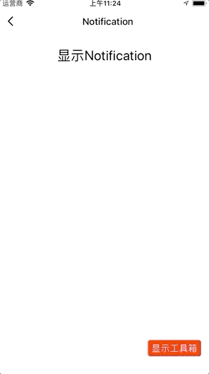
Notification 是在 NotificationLegacy 的基础上挂载在全局,并且伴有动画效果的通知组件。
说明:@2.0.0-rc.2 版本加入该组件
代码演示
说明:详细示例可参考 Demo。
警告通知
import React, { Component } from "react";
import { View } from "react-native";
import { Button, Notification } from "tuya-panel-kit";

export default class NotificationScene extends Component {
  state = {
    visible: false,
  };

  componentWillUpdate(nextProps, nextState) {
    if (nextState.visible) {
      Notification.show({
        message: "警告提示框",
        onClose: this._handleClose,
        theme: {
          successIcon: "red",
          errorIcon: "yellow",
          warningIcon: "black",
        },
      });
    } else {
      Notification.hide();
    }
  }

  _handleClose = () => {
    this.setState({ visible: false });
  };

  render() {
    return (
      <View style={{ flex: 1 }}>
        {!this.state.visible && (
          <Button
            style={{ marginTop: 12 }}
            text="显示Notification"
            textStyle={{ marginTop: 12, fontSize: 24, color: "#000" }}
            onPress={() => this.setState({ visible: true })}
          />
        )}
      </View>
    );
  }
}
交互演示
API
style
容器样式。
| 类型 | 必传 | 默认值 |
|---|---|---|
| ViewPropTypes.style | 否 | null |
icon
自定义 IconPath。
| 类型 | 必传 | 默认值 |
|---|---|---|
string |
否 | null |
variant
通知栏类型。
| 类型 | 必传 | 默认值 |
|---|---|---|
'success' | 'warning' | 'error' |
否 | warning |
enableClose
是否显示关闭按钮,若为 false ,则会隐藏关闭按钮并在 autoCloseTime 后自动触发 onClose 回调。
| 类型 | 必传 | 默认值 |
|---|---|---|
boolean |
否 | true |
autoCloseTime
自动关闭通知栏时间,只在 enableClose 为 false 时生效。
| 类型 | 必传 | 默认值 |
|---|---|---|
number |
否 | 1500 |
message
通知文案。
| 类型 | 必传 | 默认值 |
|---|---|---|
string |
否 | 无 |
onClose
点击关闭按钮时的回调。
| 类型 | 必传 | 默认值 |
|---|---|---|
() => void |
否 | null |
onPress
点击全部区域的回调。
| 类型 | 必传 | 默认值 |
|---|---|---|
() => void |
否 | null |
imageSource
图片资源。
| 类型 | 必传 | 默认值 |
|---|---|---|
number |
否 | null |
imageStyle
图片样式。
| 类型 | 必传 | 默认值 |
|---|---|---|
| ViewPropTypes.style | 否 | null |
backIconSize
文案背景图标大小。
| 类型 | 必传 | 默认值 |
|---|---|---|
number |
否 | 24 |
backIconCenter
文案背景图标是否垂直居中。
| 类型 | 必传 | 默认值 |
|---|---|---|
bool |
否 | false |
children
子元素。
| 类型 | 必传 | 默认值 |
|---|---|---|
any |
否 | null |
theme
通知栏的主题配置。
| 类型 | 必传 | 默认值 |
|---|---|---|
INotificationTheme |
否 | {} |
interface INotificationTheme {
  background: ColorPropType;
  text: ColorPropType;
  successIcon: ColorPropType;
  noticeIcon: ColorPropType;
  errorIcon: ColorPropType;
  closeIcon: ColorPropType;
  radius: number;
}
该内容对您有帮助吗?
是意见反馈该内容对您有帮助吗?
是意见反馈
关注“涂鸦智能”
涂鸦服务尽在掌握

关注“全球智能商业”
第一时间获取物联网资讯


