Popup 弹出层
更新时间:2021-04-22 10:21:28LLM 副本以 Markdown 格式查看下载 PDF
简介
Popup弹出层是一系列用于显示业务相关组件的常用弹出窗口的集合。
代码演示
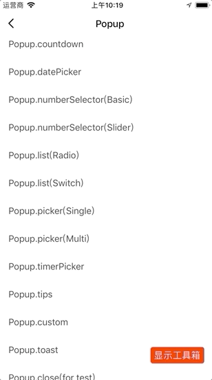
说明:详细示例参考 Demo。
倒计时弹出层
Popup.countdown({
  title: "倒计时弹出层",
  cancelText: "取消",
  confirmText: "确认",
  hourText: "小时",
  minuteText: "分钟",
  value: this.state.countdown,
  onMaskPress: ({ close }) => {
    close();
  },
  onConfirm: (data, { close }) => {
    this.setState({ countdown: data.hour * 60 + data.minute });
    close();
  },
});
日期选择弹出层
Popup.datePicker({
  title: "生日",
  cancelText: "取消",
  confirmText: "确认",
  hourText: "小时",
  minuteText: "分钟",
  defaultDate: this.state.date,
  mode: "datetime",
  minDate: new Date(1918, 0, 1, 0, 0, 0),
  maxDate: new Date(2018, 11, 31, 23, 59, 59),
  onMaskPress: ({ close }) => {
    close();
  },
  onConfirm: (date, { close }) => {
    this.setState({ date });
    close();
  },
});
时间段选择弹出层
Popup.timerPicker({
  title: "时间段选择",
  cancelText: "取消",
  confirmText: "确认",
  startTime: this.state.timerPickerValue[0],
  endTime: this.state.timerPickerValue[1],
  is12Hours: true,
  onMaskPress: ({ close }) => {
    close();
  },
  onConfirm: ({ startTime, endTime }, { close }) => {
    this.setState({ timerPickerValue: [startTime, endTime] });
    close();
  },
});
数值选择弹出层
Popup.numberSelector({
  title: "温度调节 (℃)",
  cancelText: "取消",
  confirmText: "确认",
  value: this.state.numberValue,
  min: 0,
  max: 50,
  onMaskPress: ({ close }) => {
    close();
  },
  onConfirm: (value, { close }) => {
    this.setState({ numberValue: value });
    close();
  },
});
列表选择弹出层
Popup.list({
  type: "switch",
  dataSource: [
    {
      key: "1",
      title: "1",
      value: "1",
    },
    {
      key: "2",
      title: "2",
      value: "2",
    },
  ],
  title: "List",
  cancelText: "取消",
  confirmText: "确认",
  showBack: true,
  onBack: ({ close }) => {
    console.log('I am Popup.list.radio');
    close();
  },
  value: this.state.listValue,
  onMaskPress: ({ close }) => {
    close();
  },
  onConfirm:(value, { close }) => {
    this.setState({ listValue: value });
    close();
  },
});
Picker 选择弹出层
-
单
pickerPopup.picker({ dataSource: [ { label: "1", value: "1", }, { label: "2", value: "2", }, ], title: "Picker", cancelText: "取消", confirmText: "确认", value: this.state.pickerValue, label: "haha", onMaskPress: ({ close }) => { close(); }, onConfirm: (value, idx, { close })=> { this.setState({ pickerValue: value }); close(); }, }); -
多
pickerPopup.picker({ dataSource: [ [ { label: "a", value: "a", }, { label: "b", value: "b", }, { label: "c", value: "c", }, ], [ { label: "1", value: "1", }, { label: "2", value: "2", }, { label: "3", value: "3", }, ], [ { label: "m", value: "m", }, { label: "x", value: "x", }, { label: "d", value: "d", }, ], ], singlePicker: false, title: "Picker", cancelText: "取消", confirmText: "确认", value: this.state.pickerValues, label: ["$", "%"], onMaskPress: ({ close }) => { close(); }, onConfirm: (value) => { this.setState({ pickerValues: value }); Popup.close(); }, });
自定义弹出层
弹出一个自定义内容对话框。
Popup.custom({
  content: (
    <View
      style={{
        height: 200,
        alignItems: "center",
        justifyContent: "center",
        backgroundColor: "#fff",
      }}
    >
      <Text style={{ fontSize: 36, color: "#000" }}>Custom Content</Text>
    </View>
  ),
  title: "Custom",
  cancelText: "取消",
  confirmText: "确认",
  onMaskPress: ({ close }) => {
    close();
  },
  onConfirm: (date, { close }) => {
    Popup.close();
  },
});
Toast 弹出层
Popup.toast({
  message: "I am Toast",
});
交互演示
API
说明:Popup API 除了
close以外的第一个参数为组件的props,第二个参数为Modal的props。示例:Popup.someMethod(props: Object, modalProps?: Object)。
Popup 通用
| 属性 | 说明 | 类型 | 默认值 | 必传 |
|---|---|---|---|---|
| wrApperStyle | 容器样式 | ViewPropTypes.style | null | 否 |
| title | Popup 头部标题 | string | ReactElement |
Modal |
否 |
| titleTextStyle | Popup 头部标题样式 | Text.propTypes.style | null | 否 |
| titleWrapperStyle | Popup 头部样式 | ViewPropTypes.style | null | 否 |
| switchValue | 头部栏按钮状态,若该值存在则头部栏将会显示 Switch 按钮 | boolean |
undefined | 否 |
| onSwitchValueChange | 头部栏按钮切换回调 | value => void |
null | 否 |
| footer | 自定义 footer | ReactElement |
null | 否 |
| footerType | footer 容器的显示状态。
|
both | singleConfirm | singleCancel |
both |
否 |
| footerWrapperStyle | footer 容器样式 |
ViewPropTypes.style | null | 否 |
| cancelText | 取消文案 | string |
'' |
否 |
| cancelTextStyle | 取消文字样式 | Text.propTypes.style | null | 否 |
| confirmText | 确认文案 | string |
'' |
否 |
| confirmTextStyle | 确认文字样式 | Text.propTypes.style | null | 否 |
| onCancel | 取消点击回调 | function |
null | 否 |
| onConfirm | 确认点击回调 | function |
null | 否 |
| motionType | 动画类型 | string |
PullUp |
否 |
| motionConfig | 动画配置 | object |
null | 否 |
| showBack | 是否显示返回按钮 | boolean |
false |
否 |
| onBack | 返回回调 | function |
null | 否 |
Popup.countdown
倒计时弹出层。除通用属性以外还包括以下属性。
| 属性 | 说明 | 类型 | 默认值 | 必传 |
|---|---|---|---|---|
| value | 倒计时具体值 | number |
null | 是 |
| onlyone | 是否只显示分钟 | boolean |
false |
否 |
| min | 倒计时最小值,单位为分钟 | number |
0 | 否 |
| max | 倒计时最大值,单位为分钟 | number |
1440 | 否 |
| step | 倒计时步长 | number |
1 | 否 |
| hourText | 小时文案 | string |
Hour |
否 |
| minuteText | 分钟文案 | string |
Minute |
否 |
Popup.datePicker
日期选择弹出层。参考 Popup 通用属性 和DatePicker组件。
Popup.timerPicker
时间段选择弹出层。参考 Popup 通用属性和TimerPicker组件。
Popup.numberSelector
数值选择弹出层。除通用属性以外还包括以下属性。
| 属性 | 说明 | 类型 | 默认值 | 必传 |
|---|---|---|---|---|
| type | 数值选择弹出层类型 | basic | slider |
basic |
否 |
| value | 具体值 | number |
null | 是 |
| max | 可选最大值 | number |
100 | 否 |
| min | 可选最小值 | number |
0 | 否 |
| step | 步长 | number |
1 | 否 |
| scale | 倍数 | number |
0 | 否 |
| onValueChange | 值变更事件 | value => void |
() => {} | 否 |
Popup.list
列表选择弹出层。Popup.list 继承自TYFlatList,因此除了通用属性外还包含 TYFlatList Prop及以下属性。
| 属性 | 说明 | 类型 | 默认值 | 必传 |
|---|---|---|---|---|
| listItemStyle | 设置每个 listItem 的样式 |
ViewPropTypes.style | null | 否 |
| maxItemNum | 最大列表数量 | number |
5 | 否 |
| dataSource | 数据源,继承自TYFlatList.Item |
array |
[] | 否 |
| selectedIcon | 设置 type 为 radio 时选中的图标 |
ReactElement |
null | 否 |
| type | 列表选择弹出层的类型 | switch | radio |
radio | 否 |
| iconTintColor | 设置 type 为 radio 时选中图标的颜色 |
ColoPropType | #44DB5E | 否 |
| contentCenter | 内容是否居中 | boolean |
true | 否 |
| value | 选中的值。多选类型为 array,单选则为 string 或者 number |
array | string | number |
-1 | 否 |
| onSelect | 选择事件回调 | value => void |
() => {} | 否 |
Popup.picker
选择弹出层。除通用属性以外还包括以下属性。
| 属性 | 说明 | 类型 | 默认值 | 必传 |
|---|---|---|---|---|
| pickerWrapperStyle | Picker 容器样式 | ViewPropTypes.style | null | 否 |
| pickerStyle | Picker 样式 | ViewPropTypes.style | null | 否 |
| label | Picker 的标签 | string | array |
'' | 否 |
| dataSource | Picker 的数据源 | array |
[] | 否 |
| onValueChange | 值变更事件 | (value, idx)=> void |
() => {} | 否 |
| singlePicker | 是否只显示一个 picker | boolean |
true | 否 |
| spacing | picker 两边的边距 | boolean |
0 | 否 |
| labelOffset | label 距离 picker 的偏移量 | number |
22 | 否 |
| pickerFontColor | picker 的字体颜色 | ColorPropType | #333 | 否 |
| pickerUnitColor | picker 的单位颜色 | ColorPropType | #333 | 否 |
说明:
picker数据源的具体类型如下。PropTypes.arrayOf( PropTypes.shape({ value: PropTypes.oneOfType([ PropTypes.string, PropTypes.number, PropTypes.bool, PropTypes.array, // 若为多picker则需要为数组 ]), label: PropTypes.oneOfType([ PropTypes.string, PropTypes.array, // 若为多picker则需要为数组 ]), }) );
Popup.custom
自定义对话框。除了 Popup 通用属性外,Popup.custom 另外包含以下属性。
| 属性 | 说明 | 类型 | 默认值 | 必传 |
|---|---|---|---|---|
| content | 自定义内容 | any |
null | 是 |
Popup.toast
自定义对话框。除了 Popup 通用属性外,Dialog.custom 还包含以下属性。
| 属性 | 说明 | 类型 | 默认值 | 必传 |
|---|---|---|---|---|
| style | 容器样式 | ViewPropTypes.style | null | 否 |
| theme | 主题配置 | Object |
{<br /> background: '#fff5e5',<br /> text: '#F56351',<br /> closeIcon: 'rgba(0, 0, 0, 0.3)',noticeIcon: '#F56361',} |
否 |
| enableClose | 是否允许主动关闭 | boolean |
true | 否 |
| onClose | 关闭事件回调 | () => void |
null | 否 |
| children | 子元素 | any |
null | 否 |
Popup.close
关闭当前存在的弹出层。
该内容对您有帮助吗?
是意见反馈该内容对您有帮助吗?
是意见反馈
关注“涂鸦智能”
涂鸦服务尽在掌握

关注“全球智能商业”
第一时间获取物联网资讯


