Progress 进度条
更新时间:2021-04-22 10:21:29LLM 副本以 Markdown 格式查看下载 PDF
简介
Progress 进度条组件用于展示任务的进度,同时支持通过手势控制当前的进度值。
说明:@2.0.0-rc.2 版本加入该组件。
代码演示
说明:详细示例可参考 Demo。
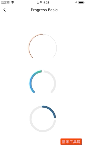
基础使用
/* eslint-disable react/prefer-stateless-function */

import React from "react";
import { View } from "react-native";
import { Progress } from "tuya-panel-kit";

class ProgressScene extends React.PureComponent {
  constructor(props) {
    super(props);
    this.state = {
      value: 50,
    };
  }
  render() {
    return (
      <View style={{ flex: 1, justifyContent: "center", alignItems: "center" }}>
        <Progress scaleHeight={2} />
        <Progress
          style={{ marginTop: 30 }}
          foreColor={{
            "0%": "#1381FB",
            "100%": "#00C36C",
          }}
          needMaxCircle={true}
          startColor="#1381FB"
          thumbRadius={4}
          value={this.state.value}
          startDegree={135}
          andDegree={270}
          stepValue={10}
          onValueChange={(v) => {
            console.log(v);
            this.setState({ value: v });
          }}
        />
        <Progress
          style={{ marginTop: 30 }}
          startDegree={270}
          andDegree={360}
          min={0}
          max={100}
          value={25}
          thumbRadius={3}
          needMaxCircle={true}
          needMinCircle={true}
          foreColor="#135381"
          stepValue={5}
        />
      </View>
    );
  }
}

export default ProgressScene;
交互演示
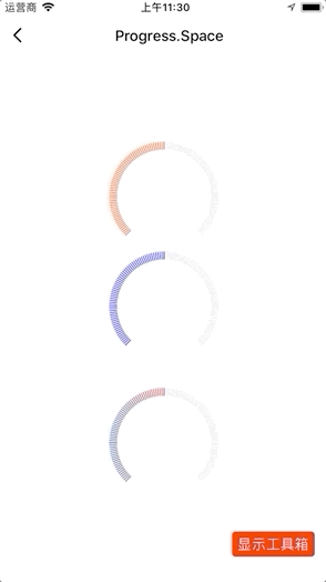
间距形式
/* eslint-disable react/prefer-stateless-function */
import React from "react";
import { View } from "react-native";
import { Progress } from "tuya-panel-kit";

class ProgressGradientScene extends React.PureComponent {
  constructor(props) {
    super(props);
    this.state = {
      value: 50,
    };
  }
  render() {
    return (
      <View style={{ flex: 1, justifyContent: "center", alignItems: "center" }}>
        <Progress.Space />
        <Progress.Space
          foreColor="blue"
          stepValue={5}
          value={this.state.value}
          onValueChange={(v) => {
            console.log(v);
            this.setState({ value: v });
          }}
        />
        <Progress.Space
          style={{ marginTop: 30 }}
          foreColor={{ "0%": "#1356A1", "100%": "#E71D2B" }}
        />
      </View>
    );
  }
}

export default ProgressGradientScene;
交互演示
API - 通用
style
进度条样式。
| 类型 | 必传 | 默认值 |
|---|---|---|
| ViewPropTypes.style | 否 | null |
value
进度条到达当前位置所转动的度数。
| 类型 | 必传 | 默认值 |
|---|---|---|
Number |
否 | 50 |
startDegree
开始角度。以时钟三点位置为起点,顺时针转动的度数。
| 类型 | 必传 | 默认值 |
|---|---|---|
Number |
否 | 135 |
andDegree
在开始角度的基础上增加的度数。
| 类型 | 必传 | 默认值 |
|---|---|---|
Number |
否 | 270 |
min
进度的最小值,单位为度。
| 类型 | 必传 | 默认值 |
|---|---|---|
Number |
否 | 0 |
max
进度的最大值,单位为度。
| 类型 | 必传 | 默认值 |
|---|---|---|
Number |
否 | 100 |
stepValue
进度条的步长。
| 类型 | 必传 | 默认值 |
|---|---|---|
Number |
否 | 0 |
backStrokeOpacity
大于具体值的不透明度。
| 类型 | 必传 | 默认值 |
|---|---|---|
Number |
否 | 1 |
foreStrokeOpacity
小于具体值的不透明度。
| 类型 | 必传 | 默认值 |
|---|---|---|
Number |
否 | 1 |
scaleHeight
进度条渲染的高度,单位为 px。
| 类型 | 必传 | 默认值 |
|---|---|---|
Number |
否 | 9 |
disabled
是否可以手势滑动。
| 类型 | 必传 | 默认值 |
|---|---|---|
Bool |
否 | false |
foreColor
小于具体值的颜色。
| 类型 | 必传 | 默认值 |
|---|---|---|
string │ object │ Array<{ "offset": "string", "stopColor": "string", "stopOpacity": "string" }> |
否 | #FF4800 |
onValueChange
值改变的回调。
| 类型 | 必传 | 默认值 |
|---|---|---|
Func |
否 | () => {} |
onSlidingComplete
滑动结束的回调。
| 类型 | 必传 | 默认值 |
|---|---|---|
Func |
否 | () => {} |
x1
渐变起始点的 x 轴坐标。
| 类型 | 必传 | 默认值 |
|---|---|---|
String |
否 | "0%" |
x2
渐变终点的 x 轴坐标。
| 类型 | 必传 | 默认值 |
|---|---|---|
String |
否 | "100%" |
y1
渐变起始点的 y 轴坐标。
| 类型 | 必传 | 默认值 |
|---|---|---|
String |
否 | "0%" |
y2
渐变终点的 y 轴坐标。
| 类型 | 必传 | 默认值 |
|---|---|---|
String |
否 | "0%" |
renderCenterView
圆环中心自定义内容。
| 类型 | 必传 | 默认值 |
|---|---|---|
Element |
否 | null |
pointerEvents
支持手势操作的范围。
| 类型 | 必传 | 默认值 |
|---|---|---|
'box-none' │ 'none' │ 'box-only' │ 'auto' |
否 | box-none |
API - Progress
thumbFill
进度滑块的填充色。
| 类型 | 必传 | 默认值 |
|---|---|---|
String |
否 | #fff |
thumbStroke
进度滑块的边框色。
| 类型 | 必传 | 默认值 |
|---|---|---|
String |
否 | #fff |
thumbStrokeWidth
进度滑块边框宽度。
| 类型 | 必传 | 默认值 |
|---|---|---|
Number |
否 | 2 |
thumbRadius
进度滑块的半径。
| 类型 | 必传 | 默认值 |
|---|---|---|
Number |
否 | 2 |
needMaxCircle
是否设置最大值的进度滑块。
| 类型 | 必传 | 默认值 |
|---|---|---|
Bool |
否 | false |
needMinCircle
是否设置最小值的进度滑块。
| 类型 | 必传 | 默认值 |
|---|---|---|
Bool |
否 | false |
startColor
轨道不满 360 度时,起始点的圆环颜色。
| 类型 | 必传 | 默认值 |
|---|---|---|
String |
否 | "#FF4800" |
endColor
轨道不满 360 度时,结束点的圆环颜色。
| 类型 | 必传 | 默认值 |
|---|---|---|
String |
否 | "#FF4800" |
API - Progress.Space
scaleNumber
进度条渲染线条的数目。
| 类型 | 必传 | 默认值 |
|---|---|---|
Number |
否 | 120 |
该内容对您有帮助吗?
是意见反馈该内容对您有帮助吗?
是意见反馈
关注“涂鸦智能”
涂鸦服务尽在掌握

关注“全球智能商业”
第一时间获取物联网资讯


