Button 按钮
更新时间:2021-04-22 10:21:25LLM 副本以 Markdown 格式查看下载 PDF
Button是一个最常用的组件,主要用于纯文本、图片和按键等需要点击的场景。
代码演示
Button在指定场景中的代码示例如下。
说明:详细 Demo 参见 Button Demo。
Text
import { Button } from "tuya-panel-kit";

<Button text="点击一下我" />;
Icon
import { Button } from "tuya-panel-kit";

<Button icon="selected" iconSize={24} text="文字" />;
Image
import { Button } from "tuya-panel-kit";

<Button image={require("../../res/2.png")} />;
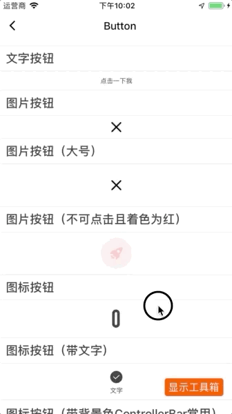
交互演示
API
继承 TouchableOpacity 组件,详情请见 TouchableOpacity。
stretch
按钮是否拉伸,跟随父容器。
| 类型 | 必选 | 默认值 |
|---|---|---|
boolean |
否 | false |
size
按钮大小。
- noSet: 不设置,靠子元素填充。
- large: 大,48px。
- normal: 普通,40px。
- small: 小,32px。
| 类型 | 必传 | 默认值 |
|---|---|---|
enum/number |
否 | noSet |
type
按钮类型。
- primary:跟随主题中的
global.brand。 - normal:即默认背景色为
transparent。
| 类型 | 必传 | 默认值 |
|---|---|---|
enum |
否 | normal |
text
按钮的文字。
| 类型 | 必传 | 默认值 |
|---|---|---|
string |
否 | 无 |
background
按钮背景,可为颜色值或渐变值。
| 类型 | 必传 | 默认值 |
|---|---|---|
string 或 object |
否 | 无 |
textSingleLine
按钮内的文字是否只显示一行,即超出部分显示省略号。
| 类型 | 必传 | 默认值 |
|---|---|---|
boolean |
否 | true |
textDirection
按钮内的文字排列方向,默认放置文字位于按钮底部。
- left: 左
- top: 顶部
- right: 右
- bottom: 底部
- center: 中间
| 类型 | 必传 | 默认值 |
|---|---|---|
enum |
否 | bottom |
icon
按钮图标 ID,详情参见 iconFont-name。
iconPath
按钮图标路径,详情参见 iconFont-d。
iconSize
按钮图标的大小,详情参见 iconFont-size。
iconColor
按钮图标的颜色,详情参见 iconFont-color。
image
按钮图片的源图。
| 类型 | 必传 | 默认值 |
|---|---|---|
Image.propTypes.source |
否 | 无 |
imageColor
按钮图片的 tintColor。
| 类型 | 必传 | 默认值 |
|---|---|---|
string |
否 | 无 |
imageStyle
按钮内的 image 样式。
| 类型 | 必传 | 默认值 |
|---|---|---|
ViewPropTypes.style |
否 | 无 |
activeOpacity
按钮点击时的透明度。
| 类型 | 必传 | 默认值 |
|---|---|---|
number(0到1) |
否 | 0.5 |
disabled
是否不可点击。
| 类型 | 必传 | 默认值 |
|---|---|---|
boolean |
否 | false |
disabledOpacity
按钮不可用时的透明度。
| 类型 | 必传 | 默认值 |
|---|---|---|
number(0到1) |
否 | 0.2 |
style
按钮的样式。
| 类型 | 必传 | 默认值 |
|---|---|---|
ViewPropTypes.style |
否 | 无 |
wrApperStyle
按钮最外部容器样式。
| 类型 | 必传 | 默认值 |
|---|---|---|
ViewPropTypes.style |
否 | 无 |
textStyle
按钮文字样式。
| 类型 | 必传 | 默认值 |
|---|---|---|
Text.propTypes.style |
否 | 无 |
badgeStyle
徽标样式。
| 类型 | 必传 | 默认值 |
|---|---|---|
ViewPropTypes.style |
否 | 无 |
badgeTextStyle
徽标文字样式。
| 类型 | 必传 | 默认值 |
|---|---|---|
Text.propTypes.style |
否 | 无 |
onPress
点击回调。
| 类型 | 必传 | 默认值 |
|---|---|---|
() => {} |
否 | 无 |
onLayout
按钮 onLayout 回调。
| 类型 | 必传 | 默认值 |
|---|---|---|
(e) => {} |
否 | 无 |
该内容对您有帮助吗?
是意见反馈该内容对您有帮助吗?
是意见反馈
关注“涂鸦智能”
涂鸦服务尽在掌握

关注“全球智能商业”
第一时间获取物联网资讯


