Tabs 纯手势标签栏
简介
Tabs 标签栏通过纯手势编写,解决了 ScrollView 实现所导致的互相嵌套中的问题。此外通过新增的懒加载的功能,拆分出TabContent 组件,供用户单独使用。
代码演示
说明:详细示例参考 Demo。
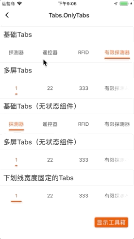
基础 Tabs
一屏默认显示四个 Tab 标签,可通过 maxItem 自定义控制一屏显示数量。
说明:如果
dataSource长度超过 maxItem, 则会自动成为多屏。
import React from "react";
import { View } from "react-native";
import { Tabs } from "tuya-panel-kit";
import TesterTitle from "../../components/TesterTitle";

export default class OnlyTabsScene extends React.PureComponent {
  constructor(props) {
    super(props);
    this.state = {
      activeKey1: "1",
      activeKey2: "3",
      d1: [
        { value: "1", label: "探测器" },
        { value: "2", label: "遥控器" },
        { value: "3", label: "RFID" },
        { value: "4", label: "有限探测器" },
      ],
      d2: [
        { value: "1", label: "1" },
        { value: "2", label: "22" },
        { value: "3", label: "333" },
        { value: "4", label: "有限探测器" },
        { value: "5", label: "55555" },
        { value: "6", label: "666666" },
        { value: "7", label: "7777777" },
        { value: "8", label: "88888888" },
      ],
    };
  }

  _handleD1Change = (tab) => {
    this.setState({ activeKey1: tab.value });
  };

  _handleD2Change = (tab) => {
    this.setState({ activeKey2: tab.value });
  };

  render() {
    return (
      <View style={{ flex: 1 }}>
        <TesterTitle title="基础Tabs" />
        <Tabs
          activeKey={this.state.activeKey1}
          dataSource={this.state.d1}
          onChange={this._handleD1Change}
        />
        <TesterTitle title="多屏Tabs" />
        <Tabs
          activeKey={this.state.activeKey2}
          dataSource={this.state.d2}
          onChange={this._handleD2Change}
        />
        <TesterTitle title="基础Tabs(无状态组件)" />
        <Tabs dataSource={this.state.d1} />
        <TesterTitle title="多屏Tabs(无状态组件)" />
        <Tabs dataSource={this.state.d2} />
        <TesterTitle title="下划线宽度固定的Tabs" />
        <Tabs underlineWidth={30} dataSource={this.state.d2} />
      </View>
    );
  }
}
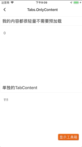
单独使用 TabContent
可用于不需要标签页的场景,例如模拟页面切换。
/* eslint-disable react/no-array-index-key */
import _ from "lodash";
import React from "react";
import { View } from "react-native";
import { Tabs } from "tuya-panel-kit";
import TesterTitle from "../../components/TesterTitle";
import Panel from "./components/Panel";

export default class OnlyContentTabsScene extends React.PureComponent {
  constructor(props) {
    super(props);
    this.state = {
      activeIndex: 0,
      d1: [
        { value: "1", label: "111" },
        { value: "2", label: "222" },
        { value: "3", label: "333" },
        { value: "4", label: "444" },
      ],
    };
  }

  _handleRelease = (gestureState, index) => {
    this.setState({ activeIndex: index });
  };

  render() {
    return (
      <View style={{ flex: 1 }}>
        <TesterTitle title="我的内容都很轻量不需要预加载" />
        <Tabs.TabContent
          preload={false}
          activeIndex={this.state.activeIndex}
          onRelease={this._handleRelease}
        >
          {this.state.d1.map((data, idx) => (
            <Panel key={idx} title={`${idx}`} />
          ))}
        </Tabs.TabContent>
        <TesterTitle title="单独的TabContent" />
        <Tabs.TabContent
          activeIndex={this.state.activeIndex}
          onRelease={this._handleRelease}
        >
          {this.state.d1.map((data, idx) => (
            <Panel key={idx} largeData={idx === 1} title={data.label} />
          ))}
        </Tabs.TabContent>
      </View>
    );
  }
}
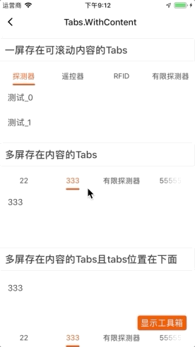
标签页配合 TabContent
import _ from "lodash";
import React from "react";
import { View, ScrollView } from "react-native";
import { Tabs, TYListItem } from "tuya-panel-kit";
import TesterTitle from "../../components/TesterTitle";
import Panel from "./components/Panel";

export default class WithContentTabsScene extends React.PureComponent {
  constructor(props) {
    super(props);
    this.state = {
      activeKey1: "1",
      activeKey2: "3",
      d1: [
        { value: "1", label: "探测器" },
        { value: "2", label: "遥控器" },
        { value: "3", label: "RFID" },
        { value: "4", label: "有限探测器" },
      ],
      d2: [
        { value: "1", label: "1" },
        { value: "2", label: "22" },
        { value: "3", label: "333" },
        { value: "4", label: "有限探测器" },
        { value: "5", label: "55555" },
        { value: "6", label: "666666" },
        { value: "7", label: "7777777" },
        { value: "8", label: "88888888" },
      ],
    };
  }

  _handleD1Change = (tab) => {
    this.setState({ activeKey1: tab.value });
  };

  _handleD2Change = (tab) => {
    this.setState({ activeKey2: tab.value });
  };

  render() {
    return (
      <View style={{ flex: 1 }}>
        {/* https://github.com/facebook/react-native/issues/11206 */}
        <TesterTitle title="一屏存在可滚动内容的Tabs" />
        <Tabs
          activeKey={this.state.activeKey1}
          dataSource={this.state.d1}
          swipeable={true}
          onChange={this._handleD1Change}
        >
          <Tabs.TabPanel>
            <ScrollView>
              {_.times(10, (n) => (
                <TYListItem key={n} title={`测试_${n}`} />
                // <TYText key={n} text={`测试_${n}`} />
              ))}
            </ScrollView>
          </Tabs.TabPanel>
          <Tabs.TabPanel>
            <TYListItem title="第二页" />
          </Tabs.TabPanel>
          <Tabs.TabPanel>
            <TYListItem title="第三页" />
          </Tabs.TabPanel>
          <Tabs.TabPanel>
            <TYListItem title="第四页" />
          </Tabs.TabPanel>
        </Tabs>
        <TesterTitle title="多屏存在内容的Tabs" />
        <Tabs
          activeKey={this.state.activeKey2}
          dataSource={this.state.d2}
          onChange={this._handleD2Change}
        >
          {this.state.d2.map((data, idx) => (
            <Panel key={idx} title={data.label} />
          ))}
        </Tabs>
        <TesterTitle title="多屏存在内容的Tabs且tabs位置在下面" />
        <Tabs
          tabPosition="bottom"
          activeKey={this.state.activeKey2}
          dataSource={this.state.d2}
          onChange={this._handleD2Change}
        >
          {this.state.d2.map((data, idx) => (
            <Panel key={idx} title={data.label} />
          ))}
        </Tabs>
      </View>
    );
  }
}
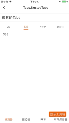
嵌套的 Tabs
import React from "react";
import { View } from "react-native";
import { Tabs, TYListItem } from "tuya-panel-kit";
import TesterTitle from "../../components/TesterTitle";
import Panel from "./components/Panel";

export default class NestedTabsScene extends React.PureComponent {
  constructor(props) {
    super(props);
    this.state = {
      activeKey1: "1",
      activeKey2: "3",
      d1: [
        { value: "1", label: "探测器" },
        { value: "2", label: "遥控器" },
        { value: "3", label: "RFID" },
        { value: "4", label: "有限探测器" },
      ],
      d2: [
        { value: "1", label: "1" },
        { value: "2", label: "22" },
        { value: "3", label: "333" },
        { value: "4", label: "4444" },
        { value: "5", label: "55555" },
        { value: "6", label: "666666" },
        { value: "7", label: "7777777" },
        { value: "8", label: "88888888" },
      ],
    };
  }

  _handleD1Change = (tab) => {
    this.setState({ activeKey1: tab.value });
  };

  _handleD2Change = (tab) => {
    this.setState({ activeKey2: tab.value });
  };

  render() {
    return (
      <View style={{ flex: 1 }}>
        <TesterTitle title="嵌套的Tabs" />
        <Tabs
          tabPosition="bottom"
          underlineStyle={{ backgroundColor: "transparent" }}
          activeKey={this.state.activeKey1}
          dataSource={this.state.d1}
          swipeable={false}
          onChange={this._handleD1Change}
        >
          <Tabs.TabPanel background="#fff">
            <Tabs
              activeKey={this.state.activeKey2}
              dataSource={this.state.d2}
              onChange={this._handleD2Change}
            >
              {this.state.d2.map((data, idx) => (
                <Panel key={idx} title={data.label} />
              ))}
            </Tabs>
          </Tabs.TabPanel>
          <Tabs.TabPanel background="#fff">
            <TYListItem title="第二页" />
          </Tabs.TabPanel>
          <Tabs.TabPanel background="#fff">
            <TYListItem title="第三页" />
          </Tabs.TabPanel>
          <Tabs.TabPanel background="#fff">
            <TYListItem title="第四页" />
          </Tabs.TabPanel>
        </Tabs>
      </View>
    );
  }
}
Tabs API
style
Tabs 的样式。
| 类型 | 必传 | 默认值 |
|---|---|---|
| ViewPropTypes.style | 否 | null |
wrapperStyle
包裹着 Tabs 以及 TabContent 的容器样式。配置 TabContent 时才生效。
| 类型 | 必传 | 默认值 |
|---|---|---|
| ViewPropTypes.style | 否 | null |
tabContentStyle
TabContent 的样式。配置 TabContent 时才生效。
| 类型 | 必传 | 默认值 |
|---|---|---|
| ViewPropTypes.style | 否 | null |
tabActiveStyle
所选中 Tab 的样式。
| 类型 | 必传 | 默认值 |
|---|---|---|
| ViewPropTypes.style | 否 | null |
tabTextStyle
未选中 Tab 的文本样式。
| 类型 | 必传 | 默认值 |
|---|---|---|
| ViewPropTypes.style | 否 | null |
tabActiveTextStyle
已选中的文本样式。
| 类型 | 必传 | 默认值 |
|---|---|---|
| ViewPropTypes.style | 否 | null |
underlineStyle
下划线的样式。
| 类型 | 必传 | 默认值 |
|---|---|---|
| ViewPropTypes.style | 否 | null |
underlineWidth
下划线的宽度,不设置则默认跟随文字宽度。
| 类型 | 必传 | 默认值 |
|---|---|---|
number |
否 | null |
defaultActiveKey
默认的激活值,设置为非受控组件时使用。
| 类型 | 必传 | 默认值 |
|---|---|---|
number | string |
否 | 0 |
activeKey
激活值。如果设置参数值,则成为受控组件。需搭配 onChange 使用。
| 类型 | 必传 | 默认值 |
|---|---|---|
number | string |
否 | null |
dataSource
数据源。
| 类型 | 必传 | 默认值 |
|---|---|---|
| ITabsDataSource | 是 | null |
interface ITabsDataSource {
  value: string; // 标签值
  label?: string; // 标签文案
  renderTab?: (
    isActive: boolean,
    state: ITabState,
    props: ITabProps
  ) => React.Element; // 自定义渲染tab标签
}
disabled
是否禁用 Tabs 标签页。
注意:仅支持对 Tabs 的禁用功能,不支持对 TabContent 的禁用。
| 类型 | 必传 | 默认值 |
|---|---|---|
boolean |
否 | false |
swipeable
TabContent 是否支持滚动。
| 类型 | 必传 | 默认值 |
|---|---|---|
boolean |
否 | true |
maxItem
一屏最多支持的 Tab 标签数量。
| 类型 | 必传 | 默认值 |
|---|---|---|
number |
否 | 4 |
tabPosition
Tab 与 TabContent 同时存在时,Tab 的排列位置。
| 类型 | 必传 | 默认值 |
|---|---|---|
top| bottom |
否 | top’ |
activeColor
激活时的颜色。
| 类型 | 必传 | 默认值 |
|---|---|---|
| ColorPropType | 否 | 主题色 |
background
Tab 标签页的背景色。
| 类型 | 必传 | 默认值 |
|---|---|---|
| ColorPropType | 否 | #fff |
preload
TabContent 是否需要预加载。
| 类型 | 必传 | 默认值 |
|---|---|---|
boolean |
否 | true |
preloadTimeout
TabContent 预加载延时时间。
| 类型 | 必传 | 默认值 |
|---|---|---|
number |
否 | null |
renderPlaceholder
自定义渲染预加载中的占位容器。
| 类型 | 必传 | 默认值 |
|---|---|---|
(activeIndex, children) => React.Element |
否 | null |
onChange
Tab 变更回调。
| 类型 | 必传 | 默认值 |
|---|---|---|
(tab, index) => void |
否 | null |
children
Tab 的子元素,一般为 TabContent。
| 类型 | 必传 | 默认值 |
|---|---|---|
array |
否 | null |
extraSpace
右边额外的留白距离,单位为 px。
@2.0.0-rc.2 版本加入该属性。
| 类型 | 必传 | 默认值 |
|---|---|---|
number |
否 | 0.5 |
velocityThreshold
TabContent 的加速度阈值,单位为px。滑动速率超过该阈值直接判断为下一页。
@2.0.0-rc.2 版本加入该属性。
| 类型 | 必传 | 默认值 |
|---|---|---|
number |
否 | 0.5 |
animationConfig
动画配置。
| 类型 | 必传 | 默认值 |
|---|---|---|
IAnimationConfig |
否 |
|
渐变示例:
interface IAnimationConfig {
  duration?: number;
  easing?: EasingFunction;
  delay?: number;
  isInteraction?: bool;
  useNativeDriver?: bool; // tabs 永远都是false,width 动画不支持
}

// 默认值
{
  duration: 200,
  easing: Easing.linear,
  delay: 0,
  isInteraction: true,
  useNativeDriver: false,
}
Tabs.Content API
style
TabContent 的样式。
| 类型 | 必传 | 默认值 |
|---|---|---|
| ViewPropTypes.style | 否 | null |
activeIndex
当前激活所处的索引。
| 类型 | 必传 | 默认值 |
|---|---|---|
number |
是 | 0 |
disabled
是否禁用 TabContent。
| 类型 | 必传 | 默认值 |
|---|---|---|
boolean |
否 | false |
preload
TabContent 是否需要预加载。
| 类型 | 必传 | 默认值 |
|---|---|---|
boolean |
否 | true |
preloadTimeout
TabContent 预加载延时时间。
| 类型 | 必传 | 默认值 |
|---|---|---|
number |
否 | null |
onMove
TabContent 滑动回调。
| 类型 | 必传 | 默认值 |
|---|---|---|
(gestureState, index, percent) => void |
否 | null |
onRelease
TabContent 滑动结束回调。
| 类型 | 必传 | 默认值 |
|---|---|---|
(gestureState, index, percent) => void |
否 | null |
renderPlaceholder
自定义渲染预加载中的占位容器。
| 类型 | 必传 | 默认值 |
|---|---|---|
(activeIndex, children) => React.Element |
否 | null |
children
TabContent 的子元素。
| 类型 | 必传 | 默认值 |
|---|---|---|
array |
否 | null |
velocityThreshold
TabContent 的加速度阈值,单位为 px。滑动速率超过该阈值判断为下一页。
@2.0.0-rc.2 版本加入该属性
| 类型 | 必传 | 默认值 |
|---|---|---|
number |
否 | 0.5 |
animationConfig
动画配置
| 类型 | 必传 | 默认值 |
|---|---|---|
IAnimationConfig |
否 |
|
渐变示例:
interface IAnimationConfig {
  duration?: number;
  easing?: EasingFunction;
  delay?: number;
  isInteraction?: bool;
  useNativeDriver?: bool;
}

// 默认值
{
  duration: 200,
  easing: Easing.linear,
  delay: 0,
  isInteraction: true,
  useNativeDriver: true,
}
该内容对您有帮助吗?
是意见反馈该内容对您有帮助吗?
是意见反馈


