Dialog 对话框
更新时间:2021-04-22 10:21:21LLM 副本以 Markdown 格式查看下载 PDF
Dialog对话框是一个包含了一系列常用对话框的集合,默认伴随淡入淡出的动画效果。用于显示一些类似Native效果的组件。
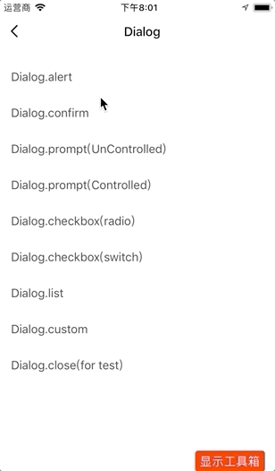
代码演示
详细示例可参考 Dialog Demo。
警告框
Dialog.alert({
  title: "标题",
  subTitle: "副标题",
  confirmText: "确认",
  onConfirm: (data, { close }) => {
      close();
  },
});
提示框
Dialog.confirm({
  title: "标题",
  subTitle: "副标题",
  cancelText: "取消",
  confirmText: "确认",
  onConfirm: (data, { close }) => {
    close();
  },
});
输入对话框
// 非受控输入框
Dialog.prompt({
  title: "非受控输入框",
  subTitle: "副标题",
  cancelText: "取消",
  confirmText: "确认",
  defaultValue: this.state.promptUnControlled,
  placeholder: "Password",
  onConfirm: (text, { close }) => {
    console.log("uncontrolled text :", text);
    this.setState({ promptUnControlled: text });
    close();
  },
});

// 受控输入框
Dialog.prompt({
  title: "受控输入框",
  subTitle: "副标题",
  cancelText: "取消",
  confirmText: "确认",
  value: this.state.promptControlled,
  placeholder: "Password",
  onChangeText: (text) => {
    // 使用value props 可令prompt成为受控组件,控制其输入框内容
    const t = +text;
    if (typeof t === "number" && !Number.isNaN(t)) {
      return text;
    }
  },
  onConfirm: (text, { close }) => {
    console.log('controlled text :', text);
    this.setState({ promptControlled: text });
    if (text.length < 2) {
     return;
    }
    close();
  },
});
单选/多选对话框
Dialog.checkbox({
  title: "Required",
  cancelText: "取消",
  confirmText: "确认",
  type: "radio",
  value: this.state.checkValueRadio,
  dataSource: [
    {
      value: "code1",
      title: "传感器选择",
    },
    {
      value: "code2",
      title: "房间传感器校准",
    },
    {
      value: "code3",
      title: "地板传感器校准",
      iconSize: 24,
      Icon: "warning",
      reverse: true,
      hideOnUnselect: true,
    },
  ],
  onConfirm: (value, { close }) => {
    this.setState({ checkValueRadio: value });
    close();
  },
});
列表对话框
弹出一个列表对话框。
Dialog.list({
  title: '这是标题',
  subTitle: '这是内容',
  dataSource: new Array(6).fill(1).map((_, idx) => ({
  title: idx === 0 ? '点我关闭' : `选项${idx}`,
  onPress: () => {
     idx === 0 && Dialog.close();
     console.log('Press', idx);
   },
  })),
  cancelText: '取消',
  confirmText: '确认',
  onConfirm: (value, { close }) => {
    close();
  },
});
自定义对话框
弹出一个自定义内容对话框。
Dialog.custom({
  title: "Custom",
  cancelText: "取消",
  confirmText: "确认",
  content: (
    <View
      style={{ height: 300, alignItems: "center", justifyContent: "center" }}
    >
      <Text style={{ fontSize: 32, color: "#000" }}>自定义内容</Text>
    </View>
  ),
  onConfirm: (value, { close }) => {
    close();
  },
});
交互演示
API
Dialog API 除了close以外的第一个参数为对应组件的props,第二个参数为Modal的props。示例:Dialog.someMethod(props: Object, modalProps?: Object)
Dialog 通用属性
| 属性 | 说明 | 类型 | 默认值 | 必传 |
|---|---|---|---|---|
| style | 容器样式 | ViewPropTypes.style | null | 否 |
| headerStyle | 头部样式 | ViewPropTypes.style | null | 否 |
| title | 标题 | string |
null | 是 |
| titleStyle | 标题样式 | Text.propTypes.style | null | 否 |
| titleNumberOfLines | 标题超过多少行显示省略号 | number |
2 | 是 |
| subTitle | 副标题 | string |
null | 否 |
| subTitleStyle | 副标题样式 | Text.propTypes.style | null | 否 |
| footerWrapperStyle | footer 容器样式 | ViewPropTypes.style | null | 否 |
| cancelText | 取消文案 | string |
'' |
否 |
| cancelTextStyle | 取消文字样式 | Text.propTypes.style | null | 否 |
| confirmText | 确认文案 | string |
'' |
否 |
| confirmTextStyle | 确认文字样式 | Text.propTypes.style | null | 否 |
| onCancel | 取消点击回调 | function |
null | 否 |
| onConfirm | 确认点击回调 | function |
null | 否 |
| motionType | 动画类型 | string |
ScaleFadeIn |
否 |
| motionConfig | 动画配置 | object |
null | 否 |
Dialog.alert
警告框。警告框只包含 confirm 按钮,不包含 cancel 按钮。alert 不包含 cancel 相关属性(cancelText、cancelTextStyle、onCancel),其他属性详情参见 Dialog 通用属性。
Dialog.confirm
提示框。提示框是在警告框的基础上添加 cancel 按钮。属性详情参见 Dialog 通用属性。
Dialog.prompt
输入对话框。属性详情参见 Dialog 通用属性。Dialog.prompt 继承自 TextInput,因此prompt另外还包含 TextInput Prop 及以下 props:
| 属性 | 说明 | 类型 | 默认值 | 必传 |
|---|---|---|---|---|
| showHelp | 是否显示帮助按钮 | boolean |
false |
否 |
| onHelpPress | 点击帮助回调 | () => void | null | 否 |
| inputWrapperStyle | TextInput 的容器样式 | ViewPropTypes.style | null | 否 |
| inputStyle | TextInput 的样式 | TextInput.propTypes.style | null | 否 |
Dialog.checkbox
单选或多选对话框。属性详情参见 Dialog 通用属性。Dialog.checkbox 中的每一个 checkbox 项都继承自 CheckboxItem,因此checkbox还包含 CheckboxItem Prop 及以下 props:
| 属性 | 说明 | 类型 | 默认值 | 必传 |
|---|---|---|---|---|
| type | checkbox 类型 | radio | switch |
radio |
否 |
| value | checkbox 值,单选类型需为string 或者 number, 多选类型为 array |
string | number | array |
null | 是 |
| maxItemNum | 数据源超出多少可滚动 | number |
5 |
否 |
| dataSource | checkbox 数据源 | Object | null | 否 |
| onChange | checkbox 更改回调 | value => void |
null | 否 |
Dialog.custom
自定义对话框。属性详情参见 Dialog 通用属性。Dialog.custom 另外包含以下 props:
| 属性 | 说明 | 类型 | 默认值 | 必传 |
|---|---|---|---|---|
| header | 自定义头部 | ReactElement | Function | null |
| footer | 自定义尾部 | ReactElement | Function | null |
| content | 自定义内容 | any |
null | 是 |
Dialog.close
关闭当前存在的对话框。
该内容对您有帮助吗?
是意见反馈该内容对您有帮助吗?
是意见反馈
关注“涂鸦智能”
涂鸦服务尽在掌握

关注“全球智能商业”
第一时间获取物联网资讯


