Tab 标签栏
更新时间:2021-04-22 10:21:28LLM 副本以 Markdown 格式查看下载 PDF
简介
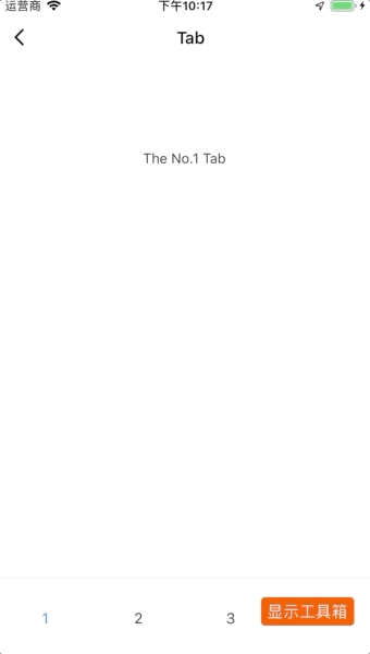
Tab 标签栏用于在不同页面间进行切换。
代码演示
说明:详细示例参考 Demo。
import React from "react";
import { Text } from "react-native";
import { Tab } from "tuya-panel-kit";

export default class TabDemo extends React.PureComponent {
  constructor(props) {
    super(props);
    this.state = { tab: "1" };
  }
  render() {
    const tabPaneArr = [1, 2, 3, 4];
    const contentStyle = {
      height: 200,
      color: "#333",
      textAlign: "center",
      lineHeight: 200,
      backgroundColor: "#fff",
    };
    const tabPanes = tabPaneArr.map((item) => (
      <Tab.TabPane key={`${item}`} tab={`${item}`}>
        <Text style={contentStyle}>{`The No.${item} Tab`}</Text>
      </Tab.TabPane>
    ));
    return (
      <Tab
        activeKey={this.state.tab}
        onChange={(value) => this.setState({ tab: value })}
      >
        {tabPanes}
      </Tab>
    );
  }
}
交互演示
API
style
包裹标签栏的容器的样式。
| 类型 | 必传 |
|---|---|
| ViewPropTypes.style | 否 |
activeKey
所激活视图的 key。
| 类型 | 必传 |
|---|---|
number|string |
否 |
defaultActiveKey
默认激活视图的 key。
| 类型 | 必传 |
|---|---|
number|string |
否 |
onChange
切换视图的回调,参数如下:
- activeKey:所激活视图的
key。
| 类型 | 必传 |
|---|---|
| (activeKey) => void | 否 |
tabStyle
设置标签栏的样式。
| 类型 | 必传 |
|---|---|
| ViewPropTypes.style | 否 |
tabBarStyle
设置 tabBar 的样式。
| 类型 | 必传 |
|---|---|
| ViewPropTypes.style | 否 |
tabContentStyle
设置标签栏内容区域的样式。
| 类型 | 必传 |
|---|---|
| ViewPropTypes.style | 否 |
tabsContainerStyle
设置包裹 tabBar 的容器的样式。
| 类型 | 必传 |
|---|---|
| ViewPropTypes.style | 否 |
tabBarBackgroundColor
设置 tabBar 的背景颜色。
| 类型 | 必传 |
|---|---|
| ViewPropTypes.style | 否 |
tabBarUnderlineStyle
设置 tabBar 的下划线样式。
| 类型 | 必传 |
|---|---|
| ViewPropTypes.style | 否 |
tabTextStyle
设置标签栏内文字的样式。
| 类型 | 必传 |
|---|---|
| Text.propTypes.style | 否 |
tabActiveTextStyle
设置激活的标签栏内文字的样式。
| 类型 | 必传 |
|---|---|
| Text.propTypes.style | 否 |
tabBarPosition
tabBar 的位置。
| 类型 | 必传 | 默认值 |
|---|---|---|
enum(top、bottom) |
否 | top |
animated
切换视图是否有动画。
| 类型 | 必传 | 默认值 |
|---|---|---|
bool |
否 | true |
swipeable
是否可滑动视图。
| 类型 | 必传 | 默认值 |
|---|---|---|
bool |
否 | true |
useViewPagerOnAndroid
是否在安卓上使用 viewPager。
| 类型 | 必传 | 默认值 |
|---|---|---|
bool |
否 | true |
children
子元素,参考Tab.TabPane。
| 类型 | 必传 |
|---|---|
element|array |
否 |
TabPane API
key
视图的标识。
| 类型 | 必传 |
|---|---|
string|number |
是 |
tabWidth
每个标签栏的宽度。
| 类型 | 必传 |
|---|---|
number |
否 |
tab
标签栏上文字或者自定义的元素。
| 类型 | 必传 |
|---|---|
string| React.ReactNode |
否 |
该内容对您有帮助吗?
是意见反馈该内容对您有帮助吗?
是意见反馈
关注“涂鸦智能”
涂鸦服务尽在掌握

关注“全球智能商业”
第一时间获取物联网资讯


