Checkbox 选择框
更新时间:2021-07-12 02:24:44LLM 副本以 Markdown 格式查看下载 PDF
Checkbox 选择框为单选框,是提供选择功能的组件。
代码演示
说明:详细 Demo 可参考 Checkbox Demo。
import React, { Component } from "react";
import { View } from "react-native";
import { Checkbox } from "tuya-panel-kit";
export default class CheckboxScene extends Component {
constructor(props) {
super(props);
this.state = {
checked: false,
disabled: false,
};
}
_handleChange = (checked) => {
this.setState({ checked });
};
render() {
return (
<View>
<Checkbox
checked={this.state.checked}
disabled={this.state.disabled}
onChange={(checked) => this.setState({ checked })}
>
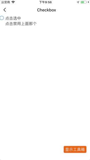
点击选中
</Checkbox>
<Checkbox
color="red"
checked={this.state.disabled}
hideOnUnselect={true}
onChange={(disabled) => this.setState({ disabled })}
>
点击禁用上面那个
</Checkbox>
</View>
);
}
}
交互演示
API
style
Checkbox 的样式。
| 类型 | 必传 |
|---|---|
| ViewPropTypes.style | 否 |
size
Checkbox 图标大小。
| 类型 | 必传 | 默认值 |
|---|---|---|
number |
否 | 28 |
disabled
是否禁用。
| 类型 | 必传 | 默认值 |
|---|---|---|
boolean |
否 | false |
disabledColor
未选中时的图标颜色。
| 类型 | 必传 | 默认值 |
|---|---|---|
| ColorPropType | 否 | null |
checked
是否选中。
| 类型 | 必传 | 默认值 |
|---|---|---|
boolean |
否 | false |
checkedIcon
选中状态图标 Path。
| 类型 | 必传 | 默认值 |
|---|---|---|
string |
否 | null |
unCheckedIcon
未选中状态图标 Path。
| 类型 | 必传 | 默认值 |
|---|---|---|
string |
否 | null |
reverse
是否颠倒 checkbox 图标和子元素的位置。
| 类型 | 必传 | 默认值 |
|---|---|---|
boolean |
否 | false |
hideOnUnselect
非选中状态下是否隐藏图标。
| 类型 | 必传 | 默认值 |
|---|---|---|
boolean |
否 | false |
color
checkbox 图标颜色。
| 类型 | 必传 | 默认值 |
|---|---|---|
| ColorPropType | 否 | #44DB5E |
onChange
checkbox 的变更事件。
| 类型 | 必传 | 默认值 |
|---|---|---|
(checked) => void |
否 | null |
children
checkbox 的子元素,一般为 Text。
| 类型 | 必传 | 默认值 |
|---|---|---|
any |
否 | null |
该内容对您有帮助吗?
是意见反馈该内容对您有帮助吗?
是意见反馈
关注“涂鸦智能”
涂鸦服务尽在掌握

关注“全球智能商业”
第一时间获取物联网资讯


