SwitchButton 开关
更新时间:2021-04-22 10:21:28LLM 副本以 Markdown 格式查看下载 PDF
简介
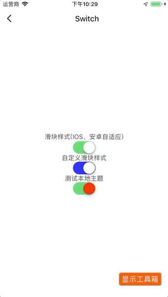
SwitchButton开关组件可以展示任务状态的开启或关闭。
代码演示
说明:详细示例参考 Demo。
受控
import React from 'react';
import { View } from 'react-native';
import { SwitchButton } from 'tuya-panel-kit';

export default class SwitchButtonDemo extends React.PureComponent {
  constructor(props) {
    super(props);
    this.state = {
      value: true;
    }
  }
  render() {
    return (
      <View style={styles.wrApper}>
        <SwitchButton
          value={this.state.value}
          onValueChange={value => { this.setState({ value }); }}
        />
      </View>
    )
  }
}
非受控
import React from "react";
import { View } from "react-native";
import { SwitchButton } from "tuya-panel-kit";

const SwitchButtonDemo = () => (
  <View style={styles.wrApper}>
    <SwitchButton
      defaultValue={true}
      onValueChange={(value) => console.log(value)}
    />
  </View>
);
交互演示
API
style
指定包裹开关组件的容器的样式。
| 类型 | 必传 |
|---|---|
| ViewPropTypes.style | 否 |
thumbStyle
指定开关中用于拖动的图标的样式。
| 类型 | 必传 |
|---|---|
| ViewPropTypes.style | 否 |
value
当前选中的值,设置了该属性即为受控组件。
| 类型 | 必传 |
|---|---|
bool |
否 |
defaultValue
默认选中的值。
| 类型 | 必传 | 默认值 |
|---|---|---|
bool |
否 | true |
useNativeDriver
是否使用 Native Driver。
| 类型 | 必传 | 默认值 |
|---|---|---|
bool |
否 | true |
size
设置开发组件的大小:
width:宽度height:高度activeSize: 滑动按钮的大小margin:滑动按钮距离最近边界的大小
| 类型 | 必传 | 默认值 |
|---|---|---|
Object |
否 | { width: 50, height: 28, activeSize: 26, margin: 1 } |
tintColor
设置当开关组件的 value 为 false 时背景颜色。
| 类型 | 必传 | 默认值 |
|---|---|---|
| Color | 否 | transparent |
onTintColor
设置当开关组件的 value 为 true 时的颜色。
| 类型 | 必传 | 默认值 |
|---|---|---|
| Color | 否 | #44DB5E |
thumbTintColor
设置当开关组件的 value 为 false 时滑动按钮的颜色。
| 类型 | 必传 | 默认值 |
|---|---|---|
| Color | 否 | #e5e5e5 |
onThumbTintColor
设置当开关组件的 value 为 true 时滑动按钮颜色,若没有设置则为 thumbTintColor 的值。
| 类型 | 必传 | 默认值 |
|---|---|---|
| Color | 否 | 无 |
borderColor
设置当滑动按钮的 value 为 false 时边框的颜色。
说明:当开关组件的
value为true时,边框颜色等于onTintColor。
| 类型 | 必传 | 默认值 |
|---|---|---|
| Color | 否 | #e5e5e5 |
disabled
是否禁用开关组件。
| 类型 | 必传 | 默认值 |
|---|---|---|
bool |
否 | false |
onValueChange
改变开关组合值时执行此回调。
| 类型 | 必传 |
|---|---|
| (value) => void | 否 |
该内容对您有帮助吗?
是意见反馈该内容对您有帮助吗?
是意见反馈
关注“涂鸦智能”
涂鸦服务尽在掌握

关注“全球智能商业”
第一时间获取物联网资讯


