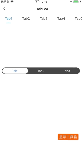
TabBar 标签栏拆分版
更新时间:2021-04-22 10:21:28LLM 副本以 Markdown 格式查看下载 PDF
简介
tabBar用于拆分 tab,进行更细粒度的控制。目前 tabBar 支持两种类型,默认类型等同于tab。
代码演示
说明:详细示例参考 Demo。
默认
import { TabBar } from "tuya-panel-kit";

this.state = {
  tab: "2",
};

const tabs = Array.from(Array(10), (v, k) => k + 1).map((v) => {
  return { key: `${v}`, title: `Tab${v}` };
});

<TabBar
  tabs={tabs}
  activeKey={this.state.tab}
  onChange={(value) => this.setState({ tab: value })}
  underlineStyle={{ width: 20, marginHorizontal: 30 }}
/>;
Radio
import { TabBar } from "tuya-panel-kit";

this.state = {
  tab: "2",
};

const tabRadios = Array.from(Array(3), (v, k) => k + 1).map((v) => {
  return { key: `${v}`, title: `Tab${v}` };
});

<TabBar
  type="radio"
  tabs={tabRadios}
  activeKey={this.state.tab}
  onChange={(value) => this.setState({ tab: value })}
  style={{ borderColor: "red", margin: 10 }}
/>;
交互演示
API
type
tab 类型。
| 类型 | 必传 | 默认值 |
|---|---|---|
| enum: radio、default | 否 | default |
tabs
tab 数据。
| 类型 | 必传 | 默认值 |
|---|---|---|
Array|TabModel |
是 | 无 |
activeKey
所选中 tab 的 key。
| 类型 | 必传 | 默认值 |
|---|---|---|
string|number |
否 | 无 |
defaultActiveKey
默认所选中 tab 的 key。
| 类型 | 必传 | 默认值 |
|---|---|---|
string|number |
否 | 0 |
onChange
tab 切换的回调。
| 类型 | 必传 | 默认值 |
|---|---|---|
| key => {} | 否 | 无 |
wrapperStyle
tab 内层容器样式。
| 类型 | 必传 | 默认值 |
|---|---|---|
| ViewPropTyps.style | 否 | 无 |
style
tab 外层容器样式。
| 类型 | 必传 | 默认值 |
|---|---|---|
| ViewPropTyps.style | 否 | 无 |
默认 Tab 特定属性
underlineStyle
下划线的样式。
| 类型 | 必传 | 默认值 |
|---|---|---|
| ViewPropTyps.style | 否 | 无 |
tabStyle
每个 tab 的样式。
| 类型 | 必传 | 默认值 |
|---|---|---|
| ViewPropTyps.style | 否 | 无 |
tabActiveStyle
所选中 tab 的样式。
| 类型 | 必传 | 默认值 |
|---|---|---|
| ViewPropTyps.style | 否 | 无 |
tabTextStyle
每个 tab 内文字的样式。
| 类型 | 必传 | 默认值 |
|---|---|---|
| Text.propTypes.style | 否 | 无 |
tabActiveTextStyle
所选中 tab 的文字样式。
| 类型 | 必传 | 默认值 |
|---|---|---|
| Text.propTypes.style | 否 | 无 |
TabModel
title
tab 的标题或者节点名称。
| 类型 | 必传 | 默认值 |
|---|---|---|
string|element |
否 | 无 |
style
tab 的定制样式。
| 类型 | 必传 | 默认值 |
|---|---|---|
| ViewPropTyps.style | 否 | 无 |
activeStyle
所选中 tab 的定制样式。
说明:仅默认类型支持。
| 类型 | 必传 | 默认值 |
|---|---|---|
| ViewPropTyps.style | 否 | 无 |
textStyle
tab 的定制文字样式。
| 类型 | 必传 | 默认值 |
|---|---|---|
| Text.propTypes.style | 否 | 无 |
activeTextStyle
所选中 tab 的定制文字样式。
| 类型 | 必传 | 默认值 |
|---|---|---|
| Text.propTypes.style | 否 | 无 |
Radio 独有属性
activeColor
所选中 tab 的颜色。
| 类型 | 必传 | 默认值 |
|---|---|---|
| string | 否 | #fff |
gutter
tab 之间的间隔。
| 类型 | 必传 | 默认值 |
|---|---|---|
| number | 否 | 2 |
该内容对您有帮助吗?
是意见反馈该内容对您有帮助吗?
是意见反馈
关注“涂鸦智能”
涂鸦服务尽在掌握

关注“全球智能商业”
第一时间获取物联网资讯


