ControllerBar 控制栏
更新时间:2021-04-22 10:21:27LLM 副本以 Markdown 格式查看下载 PDF
ControllerBar 是包含一个或一个以上按钮的控制栏。ControllerBar.Group 是控制栏的集合。
代码演示
说明 详细示例参见 ControllerBar Demo。
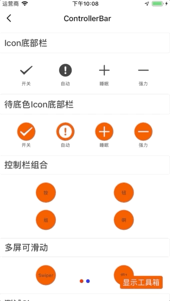
ControllerBar
import { ControllerBar } from "tuya-panel-kit";

<ControllerBar
  size={44}
  button={[
    { text: "1", type: "primary" },
    { text: "2", type: "primary" },
  ]}
/>;
ControllerBar.Group Base 版
import { ControllerBar } from "tuya-panel-kit";

<ControllerBar.Group style={{ marginTop: 20 }}>
  <ControllerBar
    size={44}
    button={[
      { text: "1", type: "primary" },
      { text: "2", type: "primary" },
    ]}
  />
  <ControllerBar
    size={44}
    button={[
      { text: "3", type: "primary" },
      { text: "4", type: "primary" },
    ]}
  />
</ControllerBar.Group>;
ControllerBar.Group Swiper 版
import { ControllerBar } from "tuya-panel-kit";

<ControllerBar.Group
  type="swiper"
  style={{ marginTop: 20 }}
  swiperConfig={{
    style: { height: 60 },
    dotActiveStyle: { backgroundColor: "red" },
    dotStyle: { backgroundColor: "blue" },
  }}
  size={44}
>
  <ControllerBar
    size={44}
    button={[
      { text: "1", type: "primary" },
      { text: "2", type: "primary" },
    ]}
  />
  <ControllerBar
    size={44}
    button={[
      { text: "3", type: "primary" },
      { text: "4", type: "primary" },
    ]}
  />
</ControllerBar.Group>;
ControllerBar.Group Divide 版
import { ControllerBar } from "tuya-panel-kit";

<ControllerBar.Group type="divide" style={{ marginTop: 20 }}>
  <ControllerBar
    size={44}
    button={[
      { text: "1", type: "primary" },
      { text: "2", type: "primary" },
    ]}
  />
  <ControllerBar
    size={44}
    button={[
      { text: "3", type: "primary" },
      { text: "4", type: "primary" },
    ]}
  />
</ControllerBar.Group>;
交互演示
API
style
外层容器的样式。
| 类型 | 必传 |
|---|---|
| ViewPropTypes.style | 否 |
wrapperStyle
按钮样式
| 类型 | 必传 |
|---|---|
| ViewPropTypes.style | 否 |
type
按钮背景类型。
primary:跟随主题中的global.brand。normal:即默认背景色为transparent。
| 类型 | 必传 | 默认值 |
|---|---|---|
enum |
否 | normal |
size
按钮大小。
noSet: 不设置,通过子元素填充。large: 大,48px。normal: 普通,40px。small: 小,32px。
| 类型 | 必传 | 默认值 |
|---|---|---|
enum/number |
否 | noSet |
stretch
按钮是否拉伸,跟随父容器。
| 类型 | 必传 | 默认值 |
|---|---|---|
bool |
否 | true |
backgroundType
背景是否为半透明。
pure:纯色。alpha:半透明。
backgroundColor
背景颜色。
| 类型 | 必传 | 默认值 |
|---|---|---|
ColorPropType |
否 | #fff |
hasBottomBorder
底部是否有边框。
| 类型 | 必传 | 默认值 |
|---|---|---|
bool |
否 | false |
button
controllerBar 内的按钮。
| 类型 | 必传 | 默认值 |
|---|---|---|
Array[ButtonPropTypes] |
是 | 无 |
Group API
style
外层容器样式。
| 类型 | 必传 | 默认值 |
|---|---|---|
| ViewPropTypes.style | 否 | 无 |
type
群组类别。
warp:普通换行。swiper:滑动。divide:相邻有下划线样式。
| 类型 | 必传 | 默认值 |
|---|---|---|
enum |
否 | warp |
size
按钮大小。
noSet: 不设置,通过子元素填充。large: 大,48px。normal: 普通,40px。small: 小,32px。
| 类型 | 必传 | 默认值 |
|---|---|---|
enum/number |
否 | noSet |
swiperConfig
type 为 swiper 时,swiper 的配置。
| 类型 | 必传 | 默认值 |
|---|---|---|
| SwiperPropTypes | 否 | 无 |
children
子节点。
| 类型 | 必传 | 默认值 |
|---|---|---|
node |
是 | 无 |
该内容对您有帮助吗?
是意见反馈该内容对您有帮助吗?
是意见反馈
关注“涂鸦智能”
涂鸦服务尽在掌握

关注“全球智能商业”
第一时间获取物联网资讯


