ToastView 吐司
更新时间:2021-04-22 10:21:28LLM 副本以 Markdown 格式查看下载 PDF
简介
ToastView 轻提示用于对用户进行提醒,不打断当前的操作。
代码演示
说明:详细示例参考 Demo。
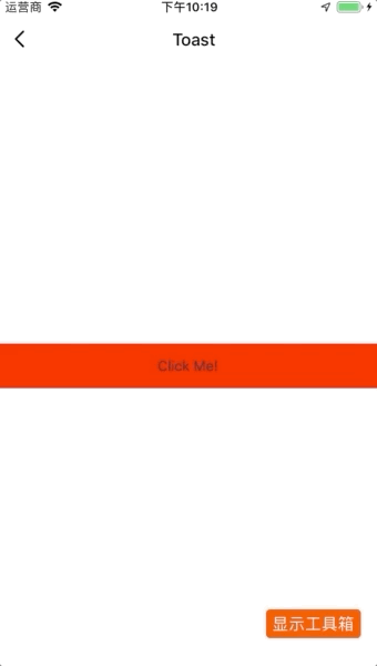
基础 ToastView
import React from "react";
import { View, TouchableOpacity } from "react-native";
import { Toast } from "tuya-panel-kit";

export default class DatePickerDemo extends React.PureComponent {
  constructor(props) {
    super(props);
    this.state = {
      show: false,
    };
  }
  render() {
    return (
      <View style={styles.wrApper}>
        <View style={{ flex: 1, justifyContent: "center" }}>
          <Toast
            show={this.state.show}
            text="I'm Iron Man!!!"
            onFinish={() => this.setState({ show: false })}
          />
          <TouchableOpacity
            style={styles.wrApperStyle}
            onPress={() => this.setState({ show: true })}
          >
            <Text style={{ textAlign: "center" }}>Click Me!</Text>
          </TouchableOpacity>
        </View>
      </View>
    );
  }
}
交互演示
ToastView - Success
说明:@2.0.0-rc.2 版本加入该组件。
import React from "react";
import { TouchableOpacity, View, StyleSheet } from "react-native";
import { Toast, TYText } from "tuya-panel-kit";

class ToastSuccessScene extends React.PureComponent {
  constructor(props) {
    super(props);
    this.state = {
      show: false,
    };
  }
  render() {
    return (
      <View style={{ flex: 1, justifyContent: "flex-start" }}>
        <Toast.Success
          show={this.state.show}
          onFinish={() => this.setState({ show: false })}
        />
        <TouchableOpacity
          style={styles.wrapperStyle}
          onPress={() => this.setState({ show: true })}
        >
          <TYText style={{ textAlign: "center" }}>Click Me!</TYText>
        </TouchableOpacity>
      </View>
    );
  }
}

const styles = StyleSheet.create({
  wrapperStyle: {
    height: 44,
    backgroundColor: "red",
    justifyContent: "center",
    marginTop: 88,
  },
});

export default ToastSuccessScene;
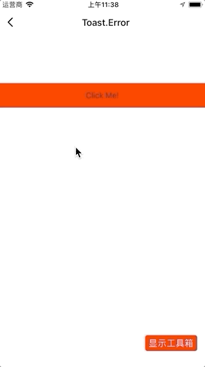
交互演示
ToastView - Error
说明:@2.0.0-rc.2 版本加入该组件。
import React from "react";
import { TouchableOpacity, View, StyleSheet } from "react-native";
import { Toast, TYText } from "tuya-panel-kit";

class ToastErrorScene extends React.PureComponent {
  constructor(props) {
    super(props);
    this.state = {
      show: false,
    };
  }
  render() {
    return (
      <View style={{ flex: 1, justifyContent: "flex-start" }}>
        <Toast.Error
          show={this.state.show}
          onFinish={() => this.setState({ show: false })}
        />
        <TouchableOpacity
          style={styles.wrapperStyle}
          onPress={() => this.setState({ show: true })}
        >
          <TYText style={{ textAlign: "center" }}>Click Me!</TYText>
        </TouchableOpacity>
      </View>
    );
  }
}

const styles = StyleSheet.create({
  wrapperStyle: {
    height: 44,
    backgroundColor: "red",
    justifyContent: "center",
    marginTop: 88,
  },
});

export default ToastErrorScene;
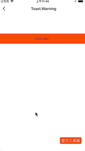
交互演示
ToastView - Warning
说明:@2.0.0-rc.2 版本加入该组件。
import React from "react";
import { TouchableOpacity, View, StyleSheet } from "react-native";
import { Toast, TYText } from "tuya-panel-kit";

class ToastWarningScene extends React.PureComponent {
  constructor(props) {
    super(props);
    this.state = {
      show: false,
    };
  }
  render() {
    return (
      <View style={{ flex: 1, justifyContent: "flex-start" }}>
        <Toast.Warning
          show={this.state.show}
          onFinish={() => this.setState({ show: false })}
        />
        <TouchableOpacity
          style={styles.wrapperStyle}
          onPress={() => this.setState({ show: true })}
        >
          <TYText style={{ textAlign: "center" }}>Click Me!</TYText>
        </TouchableOpacity>
      </View>
    );
  }
}

const styles = StyleSheet.create({
  wrapperStyle: {
    height: 44,
    backgroundColor: "red",
    justifyContent: "center",
    marginTop: 88,
  },
});

export default ToastWarningScene;
交互演示
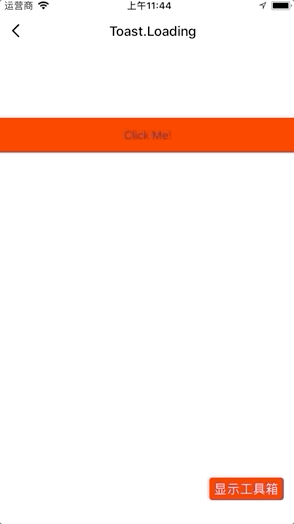
ToastView - Loading
说明:@2.0.0-rc.2 版本加入该组件。
import React from "react";
import { TouchableOpacity, View, StyleSheet } from "react-native";
import { Toast, TYText } from "tuya-panel-kit";

class ToastLoadingScene extends React.PureComponent {
  constructor(props) {
    super(props);
    this.state = {
      show: false,
    };
  }
  render() {
    return (
      <View style={{ flex: 1, justifyContent: "flex-start" }}>
        <Toast.Loading
          show={this.state.show}
          onFinish={() => this.setState({ show: false })}
        />
        <TouchableOpacity
          style={styles.wrapperStyle}
          onPress={() => this.setState({ show: true })}
        >
          <TYText style={{ textAlign: "center" }}>Click Me!</TYText>
        </TouchableOpacity>
      </View>
    );
  }
}

const styles = StyleSheet.create({
  wrapperStyle: {
    height: 44,
    backgroundColor: "red",
    justifyContent: "center",
    marginTop: 88,
  },
});

export default ToastLoadingScene;
交互演示
API - 基础
text
提示文字。
| 类型 | 必传 |
|---|---|
string |
否 |
show
是否显示。
| 类型 | 必传 |
|---|---|
bool |
是 |
onFinish
即将消失的回调。
| 类型 | 必传 |
|---|---|
| () => void | 是 |
showPosition
提示显示的位置:
- top:上方
- bottom:下方
- center:中间
| 类型 | 必传 | 默认值 |
|---|---|---|
enum: top, bottom, center |
否 | bottom |
style
提示的样式。
| 类型 | 必传 | 默认值 |
|---|---|---|
| ViewPropTypes.style | 否 | null |
contentStyle
提示内容的样式。
| 类型 | 必传 | 默认值 |
|---|---|---|
| ViewPropTypes.style | 否 | null |
textStyle
提示文字的样式。
| 类型 | 必传 | 默认值 |
|---|---|---|
| Text.propTypes.style | 否 | null |
image
提示的图标。
| 类型 | 必传 | 默认值 |
|---|---|---|
number |
否 | null |
imageStyle
提示图标的样式。
| 类型 | 必传 | 默认值 |
|---|---|---|
| Image.propTypes.style | 否 | null |
children
自定义提示的内容。
| 类型 | 必传 | 默认值 |
|---|---|---|
any |
否 | null |
API - Success、Error、Warning
contentStyle
提示内容的样式。
| 类型 | 必传 | 默认值 |
|---|---|---|
| ViewPropTypes.style | 否 | null |
showPosition
提示显示的位置:
- top:上方
- bottom:下方
- center:中间
| 类型 | 必传 | 默认值 |
|---|---|---|
enum: top, bottom, center |
否 | bottom |
color
提示图标的颜色。
| 类型 | 必传 | 默认值 |
|---|---|---|
string |
否 | #fff |
text
提示的文案。
| 类型 | 必传 | 默认值 |
|---|---|---|
string |
否 | 成功文案 |
size
图标的大小。
| 类型 | 必传 | 默认值 |
|---|---|---|
number |
否 | cx(40) |
d
图标路径。
| 类型 | 必传 | 默认值 |
|---|---|---|
string |
否 | iconfont.correct |
iconfontStyle
提示图标样式。
| 类型 | 必传 | 默认值 |
|---|---|---|
| Image.propTypes.style | 否 | { width: cx(120), height: cx(120), backgroundColor: 'rgba(0,0,0,.7)', borderRadius: cx(8), } |
API - Loading
contentStyle
提示内容的样式。
| 类型 | 必传 | 默认值 |
|---|---|---|
| ViewPropTypes.style | 否 | null |
showPosition
提示显示的位置:
- top:上方
- bottom:下方
- center:中间
| 类型 | 必传 | 默认值 |
|---|---|---|
enum: top, bottom, center |
否 | bottom |
size
提示图标的大小。
| 类型 | 必传 | 默认值 |
|---|---|---|
number |
否 | cx(40) |
color
图标颜色。
| 类型 | 必传 | 默认值 |
|---|---|---|
string |
否 | #fff |
loading
图标是否旋转加载。
| 类型 | 必传 | 默认值 |
|---|---|---|
boolean |
否 | true |
strokeWidth
图标圆环宽度。
| 类型 | 必传 | 默认值 |
|---|---|---|
number |
否 | 4 |
loadingStyle
加载图标样式。
| 类型 | 必传 | 默认值 |
|---|---|---|
| ViewPropTypes.style | 否 | null |
loadingBackgroundColor
加载背景的颜色。
| 类型 | 必传 | 默认值 |
|---|---|---|
| ColorPropType | 否 | rgba(255,255,255,.1) |
该内容对您有帮助吗?
是意见反馈该内容对您有帮助吗?
是意见反馈
关注“涂鸦智能”
涂鸦服务尽在掌握

关注“全球智能商业”
第一时间获取物联网资讯


